
Reimagining the Cataract Surgery Patient Journey
Designing clarity, confidence, and calm in a moment of medical uncertainty
Context & My Role
Role: Product Designer (UX/UI)
Platform: Mobile (iOS-first)
Scope: Conceptual, end-to-end experience
I owned the full design process from problem framing and experience strategy to wireframing, content modeling, and high-fidelity UI. My clinical background allowed me to design with an understanding of real constraints: patient anxiety, time-limited appointments, medical terminology, and the emotional weight of vision loss.
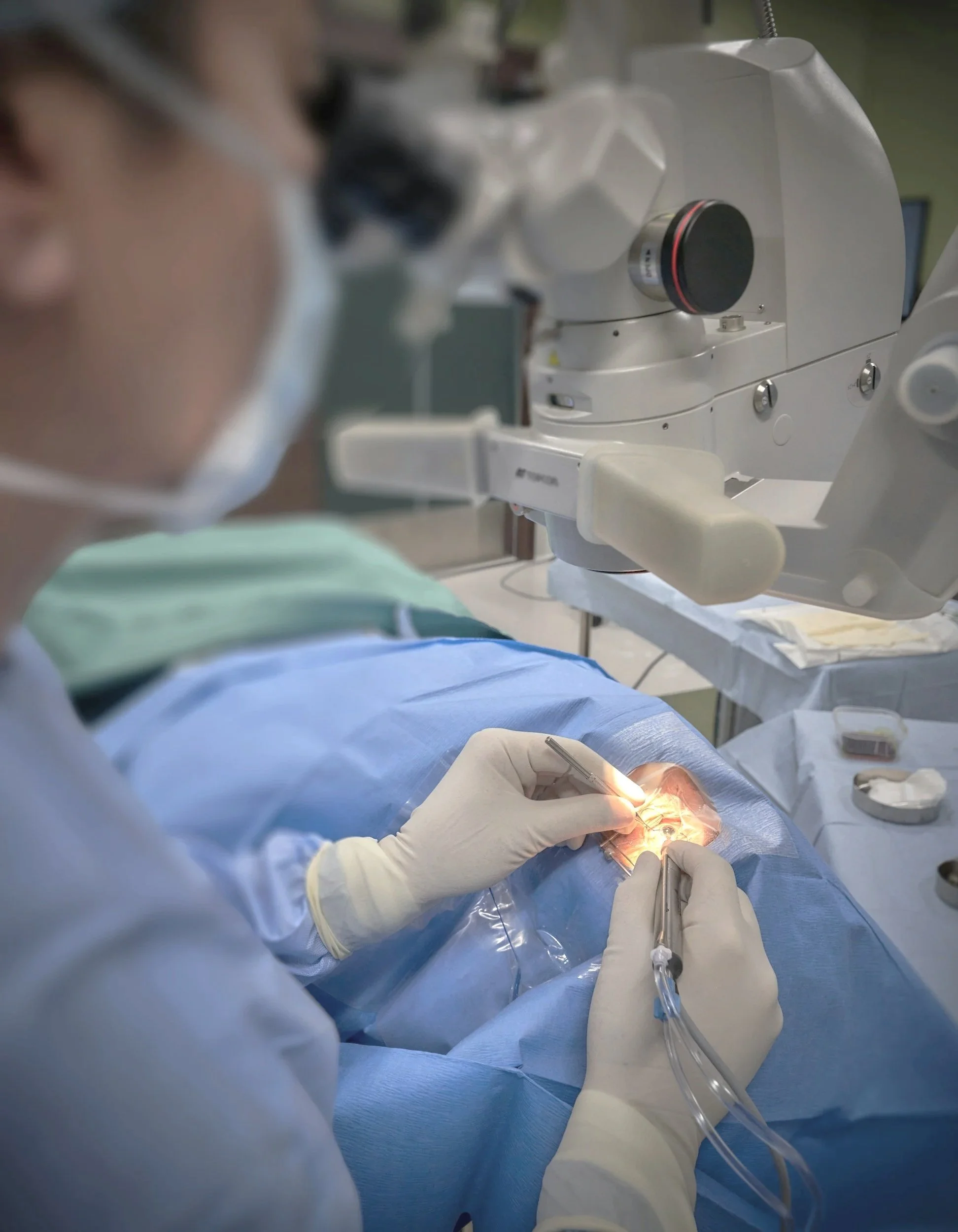
The Moment That Sparked This Project
Cataract surgery is clinically routine, but emotionally, it rarely feels that way.
In my day-to-day work supporting patients with cataracts, I noticed a consistent pattern. Patients weren’t confused because they lacked information. They were confused because the process itself felt invisible. Steps happened out of order in their minds. Calls came from unfamiliar coordinators. Scans with unfamiliar names were scheduled without context. Patients often nodded along and then asked the same questions again a few days later.
What patients were really asking was simple: “Can you show me the whole picture?”
This project began as an attempt to answer that question through design.
The Challenge: When a Clear Medical Protocol Feels Like a Maze
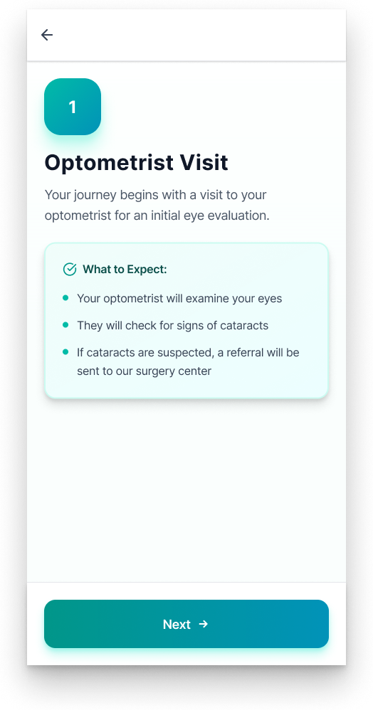
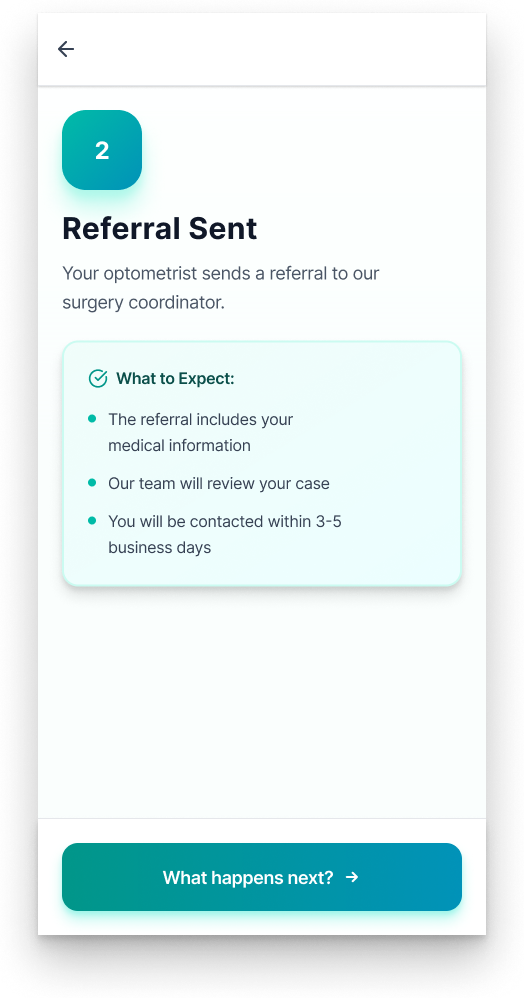
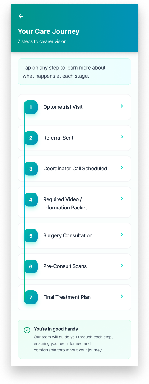
From a clinical perspective, the cataract workflow is well defined: optometry visit, referral, coordinator call, scans, consultation, and surgery planning. But for patients, this protocol is rarely experienced as a coherent journey.
Instead, it shows up as:
Disconnected phone calls
Dense paperwork
Medical terms without explanation
Long gaps with no feedback
The emotional cost is real. Patients worry they’ve missed a step. They feel unprepared walking into appointments. Staff spend valuable time repeating explanations. Anxiety compounds, especially for older adults already navigating vision loss.
The problem wasn’t the care itself. It was the experience of understanding it.
Design Intent: Turning a Protocol Into a Path
I set out to design a mobile experience that doesn’t just deliver information, but actively orients patients.
The goal was to create a digital companion that:
Makes the cataract journey visible end-to-end
Explains what’s happening and why
Reduces cognitive load through pacing and structure
Builds emotional reassurance at every step
Patients don’t struggle with complexity; they struggle with sequence. Verbal explanations fade quickly. Medical jargon creates unnecessary intimidation. And when patients don’t know what’s coming next, anxiety fills the gap.
The core insight that guided every design decision was this:
Patients don’t need more information. They need the right information, at the right time, in the right order.
Above all, the experience needed to feel calm, respectful, and human, not clinical or transactional.
User Quotes
-
“Knowing what’s coming next makes me feel a lot less anxious. I’m not second-guessing whether I missed a step.”
— Patient
-
“This would save so much time during clinic. We wouldn’t have to keep re-explaining the same steps because patients would already know what’s coming.”
— Ophthalmology Staff
-
“Patients who used this would come into their appointments way more prepared. It sets expectations before we even see them.”
— Ophthalmology Staff
Framing the Opportunity
Instead of asking how to explain cataract surgery better, I reframed the problem:
How might we help patients feel oriented throughout the cataract surgery process before confusion sets in?
That shift moved the focus away from information delivery and toward experience design.

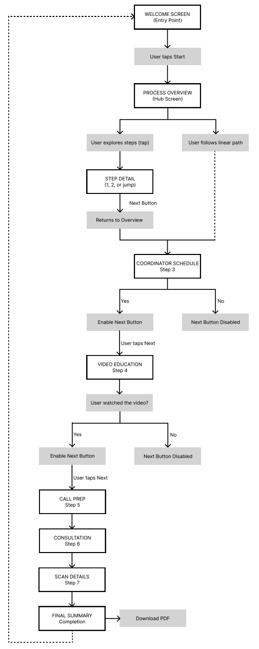
From Ideas to Structure: Early Design Thinking
Before any visual styling, I focused on flow and necessary components to help solve a cataract patient’s pain points.
Sketch
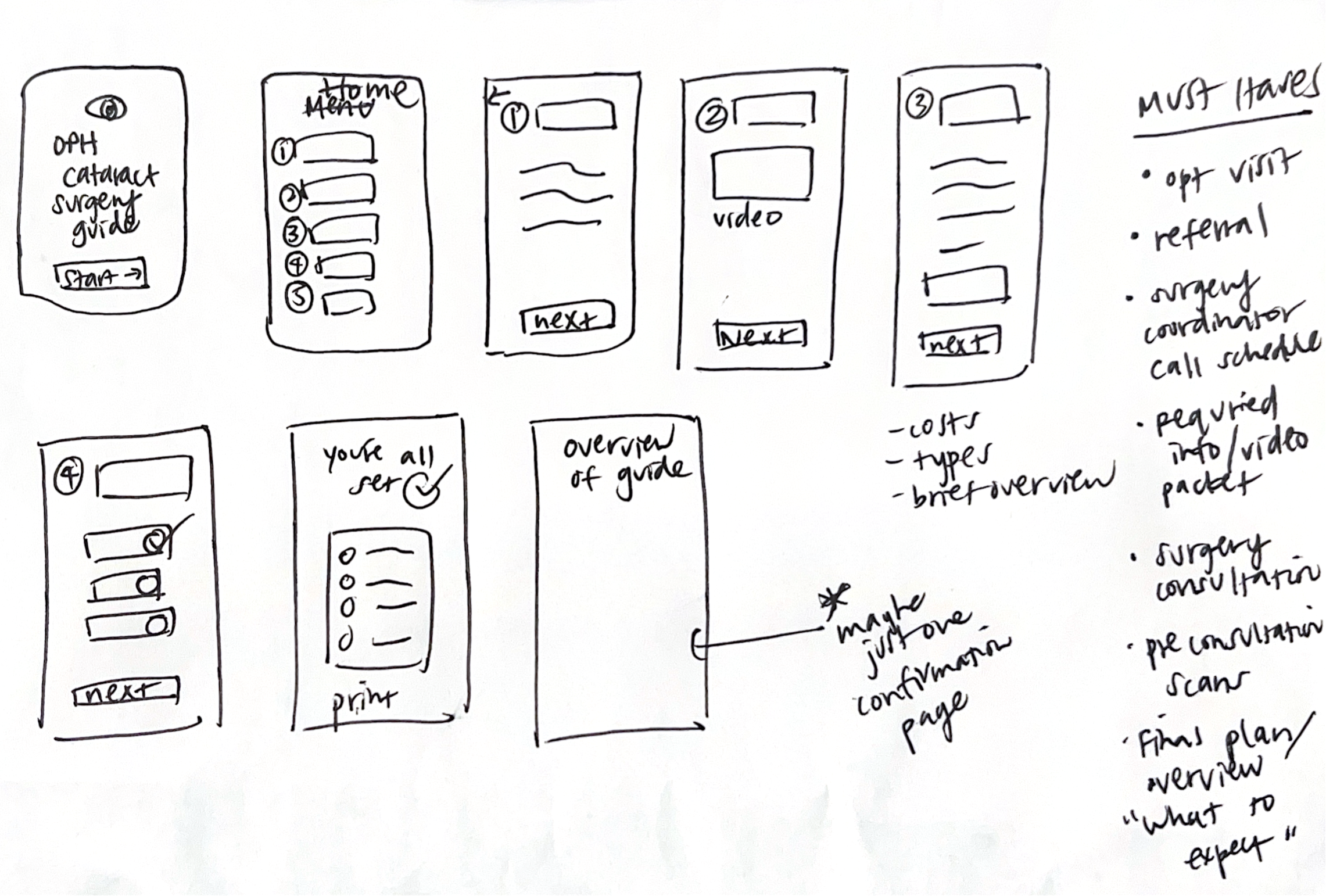
User Flow
Wireframes
Early wireframes explored how patients might mentally model the process: linear timelines, expandable checklists, and card-based layouts. I tested where reassurance mattered more than efficiency, and where simplicity mattered more than completeness.
Initial
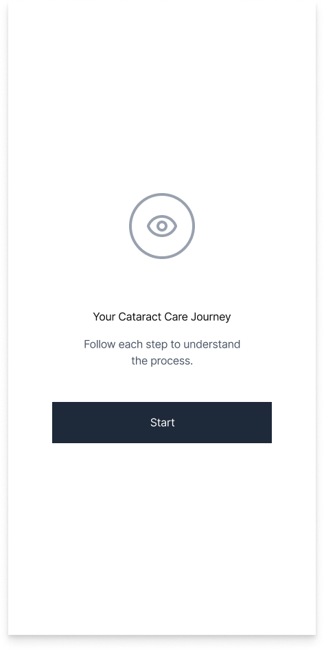
Revision
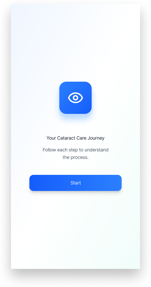
Final
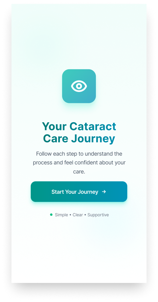
Through three rounds of iterative design, I refined the experience to balance visual calm with functional clarity for patients navigating a high-stakes medical journey. Each iteration focused on reducing cognitive load, strengthening affordances, and clarifying system status so patients could immediately understand where they were in the process and what had been completed. The final design leverages clear information hierarchy, progressive disclosure, and reassuring feedback states to support intuitive interaction while helping patients feel confident, oriented, and cared for throughout the experience.
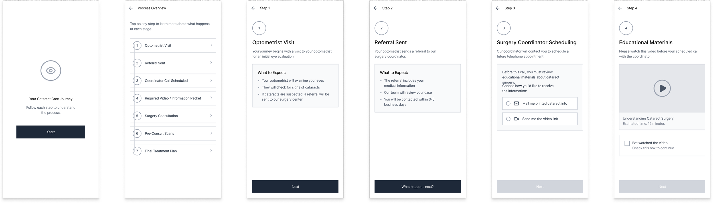
Key Screens & Design Decisions
Designing for cataract patients means designing with accessibility from the start.
Considerations included:
High contrast text for visual impairment
Large touch targets for motor ease
Plain language to reduce cognitive strain
Clear feedback and completion states
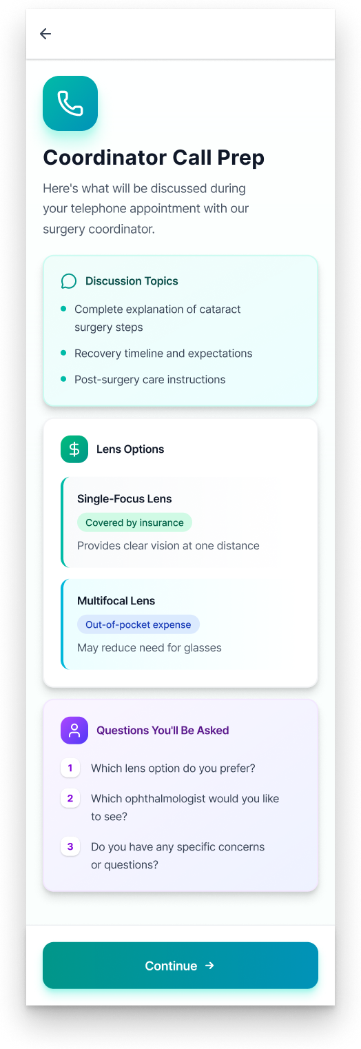
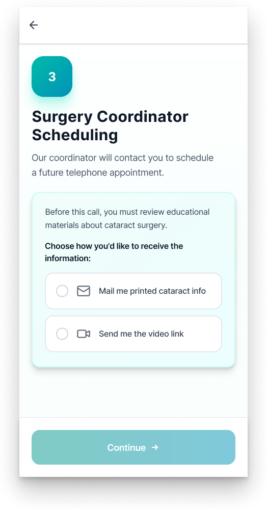
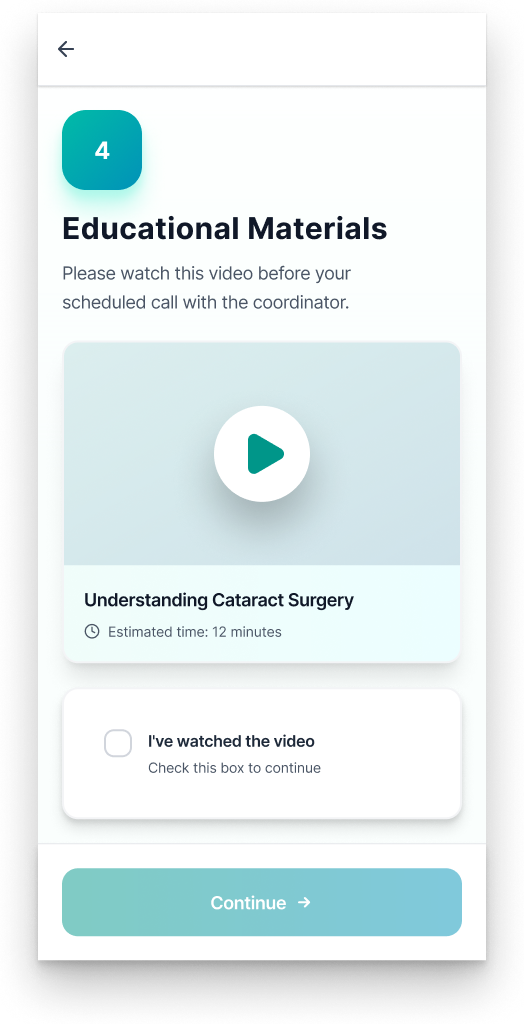
Coordinator Call Preparation
Supporting informed, low-stress decision-making
Coordinator calls are information-dense and emotionally loaded. Patients are often asked to make decisions about surgery, lens options, and providers without feeling fully prepared.
This screen reframes the call as a collaborative conversation by previewing discussion topics and surfacing key decisions ahead of time. Lens options are presented with upfront insurance context to reduce financial ambiguity - a common source of stress in real-world cataract care.
By explicitly outlining the questions patients will be asked, the design removes uncertainty and helps patients feel confident participating in the conversation rather than reacting to it.
Impact: More efficient calls, better-informed decisions, and increased patient confidence.
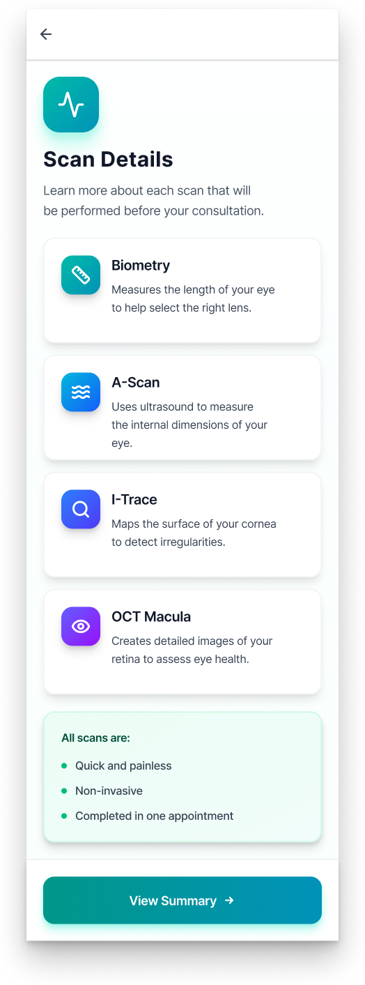
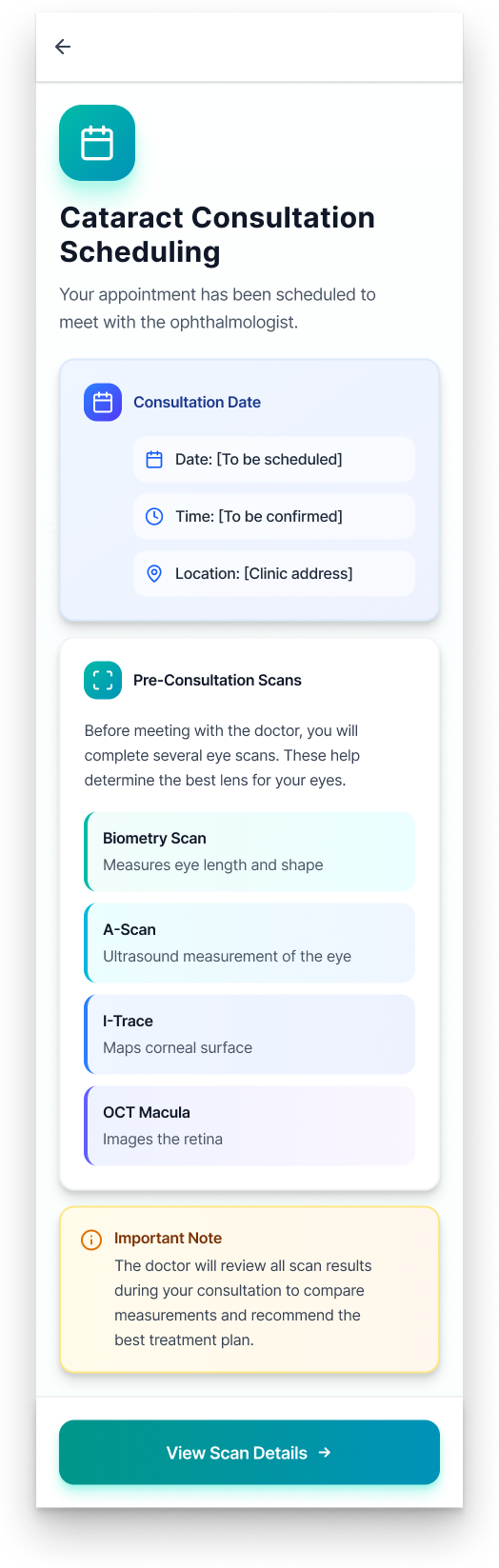
Scan Details
Making invisible medical steps understandable
Diagnostic scans are often one of the most intimidating parts of the cataract journey. Patients comply, but rarely understand why multiple scans are needed or how they influence surgical decisions.
This section breaks each scan into a distinct, approachable step, focusing on purpose rather than technical detail. By explaining how each scan contributes to lens selection and surgical planning, the design helps patients connect testing to outcomes that matter to them.
Grouping scans into a single, cohesive moment reinforces that these tests are coordinated, not redundant. This prepares patients to move through appointments with confidence.
Impact: Patients arrive more prepared and engaged, reducing confusion and repeated questions during clinic visits.
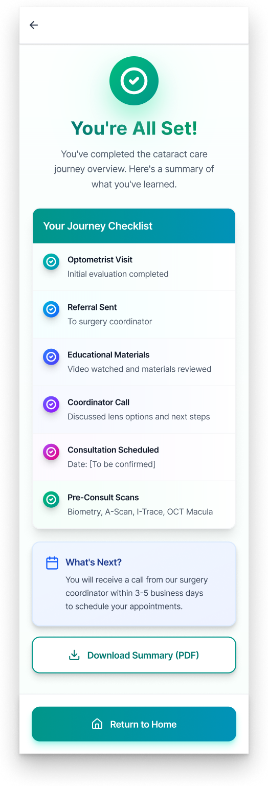
“You’re All Set” Summary
Reinforcing readiness and confidence before surgery
The “You’re All Set” moment is designed to close the loop on what can feel like a long and overwhelming process. By this point, patients have completed scans, spoken with a coordinator, and made key decisions.
This screen intentionally shifts the tone from instructional to affirming. Instead of introducing new information, it confirms completion, reinforces preparedness, and reassures patients that no additional action is required at this stage.
This helps reduce second-guessing, a common behavior observed in healthcare settings where patients fear missing an important step.
Impact: Patients leave the experience feeling prepared, supported, and confident in their progress.

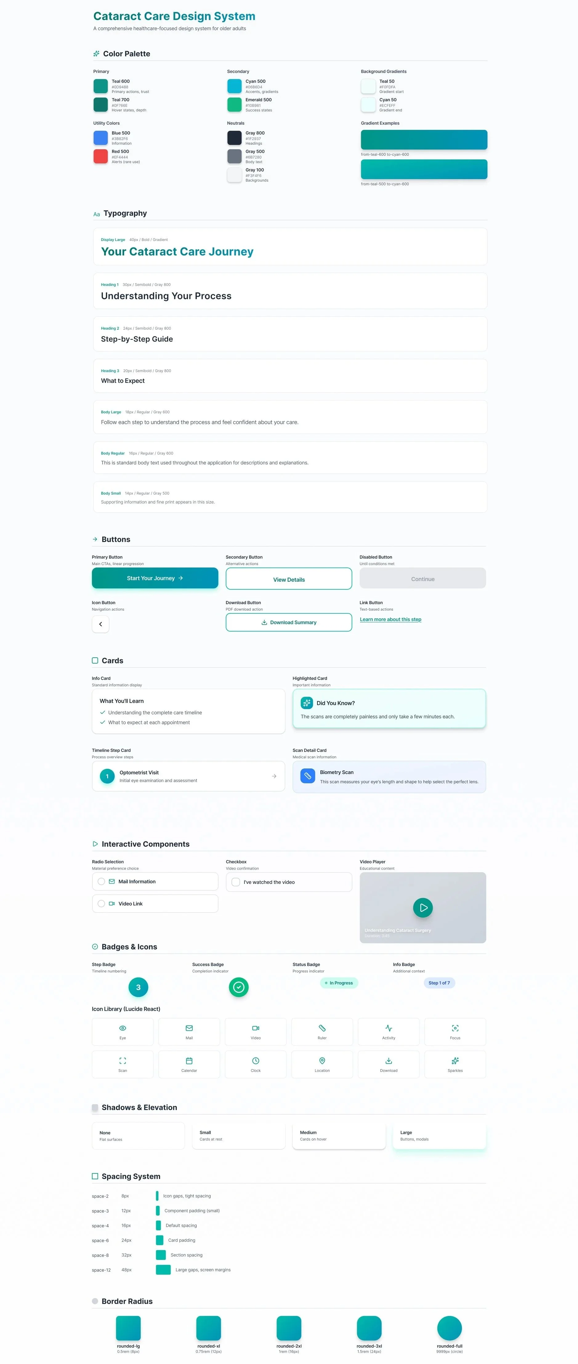
High-Fidelity Design
The visual design prioritizes calm, trust, and legibility.
Soft teal and green tones reinforce a healthcare context while avoiding a sterile feel. Generous spacing and clear typographic hierarchy reduce cognitive load. Icons act as supportive cues rather than decorative elements. The UI intentionally avoids urgency, progress indicators reassure without pressure, and calls to action are clear but gentle.

Red Route - Cataract Patient Flow

Visual Design System
Impact That Matters
While conceptual, this project reflects outcomes I’ve repeatedly seen in clinic:
Patients feel more prepared and less anxious
Consultations become more efficient and focused
Staff spend less time re-explaining the process
Trust between patient and system improves
The real value lies in helping patients feel capable during a vulnerable moment.
Reflection
This project represents how I approach design problems shaped by real human stakes.
It reinforced a principle I bring to every product challenge:
Clarity is not just usability, it’s care.
Looking Forward
Future iterations could expand into caregiver access, post-surgery recovery guidance, multilingual support, and system integrations.
But the heart of the work remains the same: turning uncertainty into understanding.
Why This Case Study Matters
This work sits at the intersection of my healthcare background and my UX practice. It demonstrates how lived experience can inform thoughtful, responsible design and how strong UX can make complex systems feel human.
This isn’t just a cataract journey. It’s an example of what happens when empathy, structure, and design rigor come together.