

Design Sprint: SimplyRecipe’d
My Role
As the lead UI/UX Designer for SimplyRecip’ed, I led the full design sprint process to create a stress-free cooking app experience. I conducted user research, identified pain points in typical recipe apps, and designed intuitive flows.
I built interactive prototypes, iterated based on usability feedback, and focused on making the app approachable for home cooks who want quick, reliable, and visually guided recipes without feeling overwhelmed.
Duration
1 week
Overview
SimplyRecip’ed is a recipe app designed to reduce the frustration and cognitive load that many users experience when cooking.
Through the sprint, I discovered that users wanted three things: clarity, guidance, and efficiency.
Tools
Figma, Miro, Google Docs
Scope
UI/UX, Sketching, Storyboarding, Competitive Analysis, Wireframing, Low-Fidelity, High-Fidelity, A/B Testing, Prototyping
Project Timeline
Day 1 - Understand and Map
I explored user frustrations, defined the core problem, and mapped a clear end-to-end experience to guide the flow of a more intuitive and supportive recipe journey.Day 3 - Decide & Story Board
I selected the strongest concept and built a detailed storyboard that visualizes the user experience from discovery through to successful recipe completion.Day 5 - Test & Validate
I conducted usability testing with 5 users, gaining valuable insights that validated the concept’s impact and highlighted opportunities for further refinement.Day 2 - Sketch Solutions
I analyzed successful apps, generated rapid ideas with Crazy 8s, and sketched a focused solution that addresses key pain points like prep clarity and real-time cooking support.Day 4 - Prototype
I translated my storyboard into a high-fidelity interactive prototype that brings the concept to life with prep screens, kitchenware visuals, and guided instructions.Day 6 & 7 - Iterate
Using feedback from testing, I refined the prototype by adjusting prep visuals, clarifying tool information, and improving the step-by-step flow to better support users through each stage of the cooking experience.Bringing Joy Back to the Kitchen: Designing a Stress-Free Recipe Experience
Cooking should be enjoyable, but for many, it feels overwhelming. Through user research and interviews, I uncovered a consistent theme: people weren’t just frustrated by unclear instructions or inaccurate cook times. Specifically, they were disrupted by the constant need to stop, search, and guess what to do next.
To explore this problem, I looked into how leading apps handled recipe flow and guidance. However, early in my sketching process, a powerful insight surfaced: users didn’t just want instructions, they craved real-time validation. They wanted to feel confident with each step, knowing they were on the right track.
PROBLEM
Day 1 - Understand and Map
Why Is Cooking So Stressful? Unpacking the Chaos Behind Online Recipes
The problem I’m trying to solve centers around the frustrating and often stressful experience of following online recipes. Many users shared that cooking, something that should be enjoyable or even relaxing, quickly becomes overwhelming when recipes lack clarity, omit key details, or include inaccurate timing.
A major pain point is the disconnect between what’s written and what’s actually happening in the kitchen. Users often find themselves second-guessing whether they’re on the right track, unsure if they’ve prepped the ingredients correctly, or scrambling to figure out what tools they need last-minute.
One strong insight that stood out is how disconnected the experience feels. People are forced to bounce between different websites or videos just to clarify one step, breaking their focus and rhythm. The timing of steps often doesn’t account for real-life cooking pace, leaving users either rushing or waiting awkwardly. Many also mentioned that instructions don’t always explain what something should look, feel, or smell like. These are crucial details that make a big difference when you're trying to follow along confidently.
The goal of this sprint is to create a recipe experience that feels smooth, supportive, and stress-free—like having a helpful friend guiding you through the kitchen.
End-to-end Experience Map
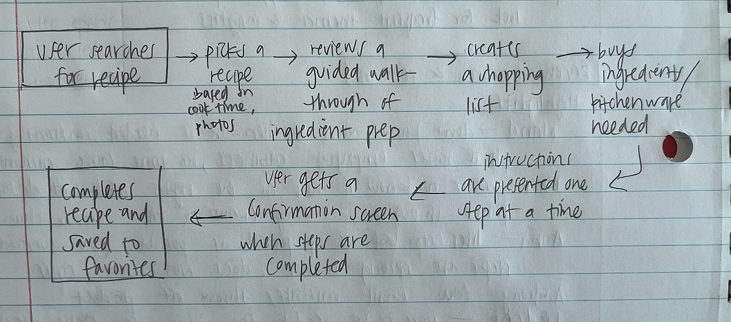
This experience map outlines a structured, user-centered flow: from selecting a recipe based on key preferences to completing it with step-by-step guidance. It ensures that users are supported at each stage with ingredient prep, shopping tools, and visual cues.
Each step is intentionally sequenced to address key pain points such as missing prep details, unclear tools, and lack of confirmation. The process promotes confidence, accuracy, and a more thorough cooking experience from start to finish.
Day 2 - Sketch Your Solution
Lightning Demo
For my lightning demos, I explored Tasty, NYT Cooking, and SideChef, which are three leading apps that approach recipe support in distinct ways. These examples helped highlight what works well in guiding users through a cooking experience and revealed key gaps that many users still struggle with. These insights directly influenced the features and flow I prioritized in my solution.
Tasty App (By Buzzfeed)

Why it’s great:
Clear, step-by-step instructions with short videos for each step
Built-in ingredient and equipment lists
Users can follow at their own paceGreat visual cues and beginner-friendly layout
What to take from it:
Bite-sized video instructions
Prep and cook sections clearly separated
Visual-first design helps reduce stress and confusion
NYT Cooking

Why it’s great:
Professional yet simple recipe format
Includes notes, ratings, and comments from real users
High focus on visual storytelling and well-written instructions
Clean layout makes it easy to scan ahead or follow along
What to take from it:
Clear formatting and organized structure
Helpful user comments for real-time clarifications
Trustworthy tone and elegant experience
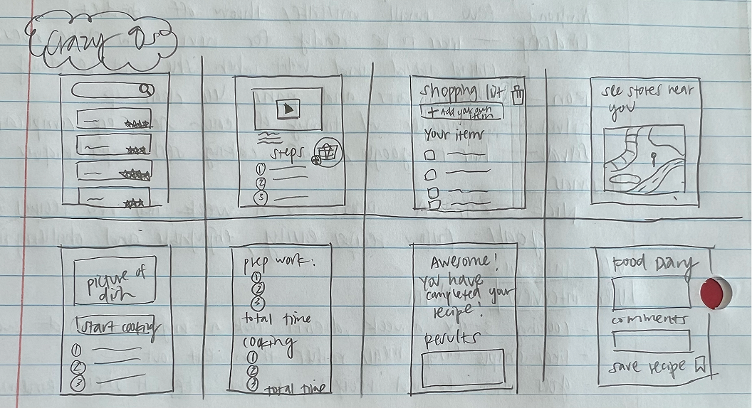
Crazy 8s
Here are eight different ideas focused on solving key user frustrations: unclear instructions and the lack of step-by-step clarity. I explored features such as visual cooking progress indicators, ingredient prep previews, smart timers, and an optional voice assistant. This helped me quickly explore a range of possible solutions and identify what ideas felt most intuitive and supportive.
Solution Sketch
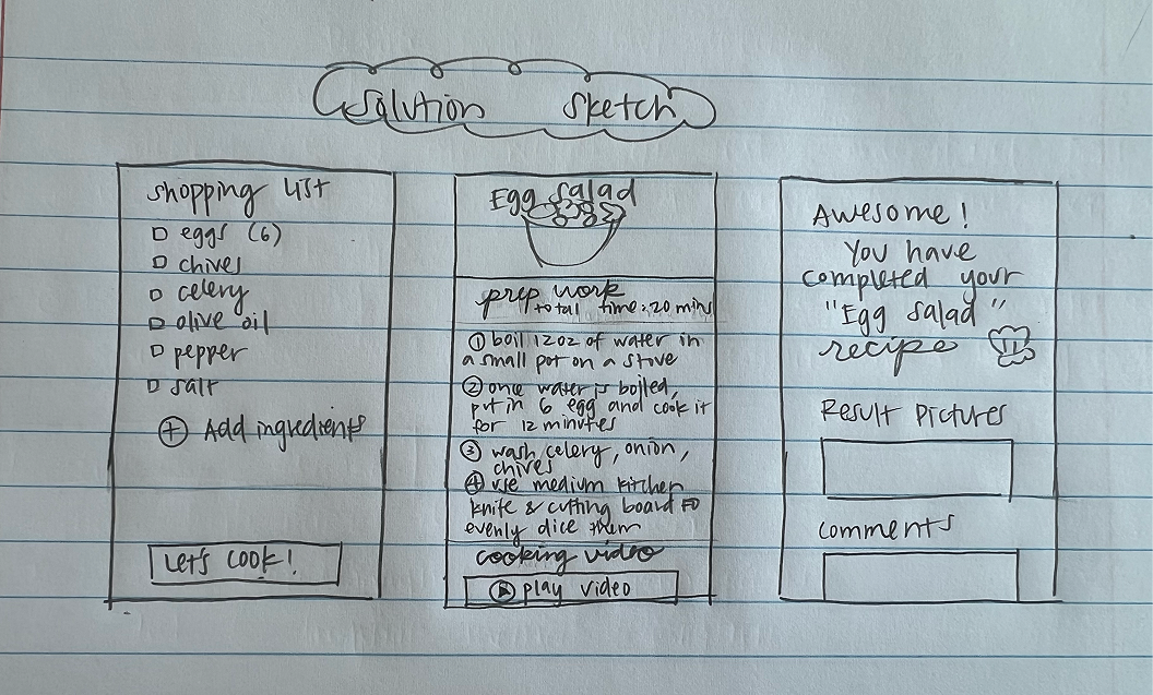
From the Crazy 8s, I selected the idea that showed the most promise: a step-by-step guided recipe screen. My solution sketch includes three panels: the screen before shows a “Start Cooking” overview with prep time and required tools. My main focus is to makes the cooking process feel approachable and easy to follow for users.
Day 3 - Design and Create a Storyboard

Storyboard
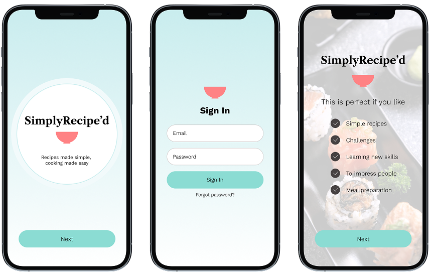
Based on this storyboard, I designed a clear end-to-end experience that directly addresses key user frustrations with recipe apps. I began by identifying major pain points, such as unclear instructions, missing prep details, and the stress of multitasking while cooking. My goal was to create a guided flow that supports users from recipe discovery to dish completion with confidence. The experience starts with a welcoming home screen and login, followed by a short preference setup to personalize content.
Users can then browse recipes, check nutritional information, and access tools like a shopping list and location-based store suggestions. Once cooking begins, the app breaks each step into simple, visual instructions using prep views, cook timers, and real-time visual cues to ensure clarity. This structure is designed to remove guesswork and support a smooth, stress-free cooking journey from start to finish.
Pain Points
Through user research and interviews, several recurring pain points emerged that disrupt the cooking experience and cause unnecessary stress. Below are the key issues users faced and the specific design solutions implemented to address them.
Clear Kitchen Tools = Confident Cooking
A key insight from user feedback was the lack of clear information about what kitchen tools or cooking gadgets are needed for a recipe.
Many users expressed frustration at realizing mid-recipe that they were missing an essential item, or having to pause and search online for what unfamiliar tools looked like.
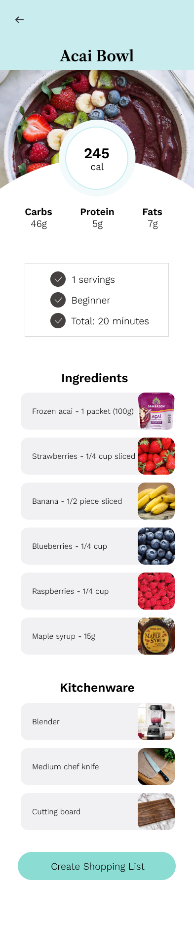
To directly address this pain point, I included a dedicated section that clearly lists required kitchenware alongside supportive visuals.This not only helps users prepare more confidently but also reduces interruptions during cooking. By offering visual cues and clear tool identification, this screen enhances planning efficiency, reduces confusion, and supports a smoother, more efficient cooking experience. make it more bullet pointsRealistic Timing Starts with Better Prep
This screen displays a dedicated preparation page that gives users a clearer and more realistic estimate of total recipe time.
During user interviews, a common frustration was that recipe apps often underestimate how long cooking takes, mainly because they leave out or minimize prep time.
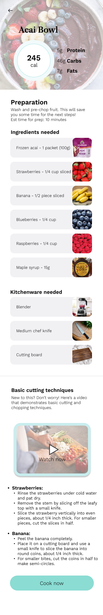
To solve this, I added a separate prep screen before the cooking instructions begin. It outlines all prep steps (like chopping, peeling, or marinating), allowing users to see exactly what's involved and how long it may take.I also included visual aids such as photos of ingredients, kitchenware, and basic cutting techniques. These visuals provide immediate clarity and support, so users don’t have to search elsewhere mid-recipe.This helps manage expectations, reduces stress, and creates a more trustworthy and user-centered recipe experience. Together, these features create a more confident and overall successful experience from start to finish.
Day 4 - Prototype
Login
Red Route One - Selecting a Recipe
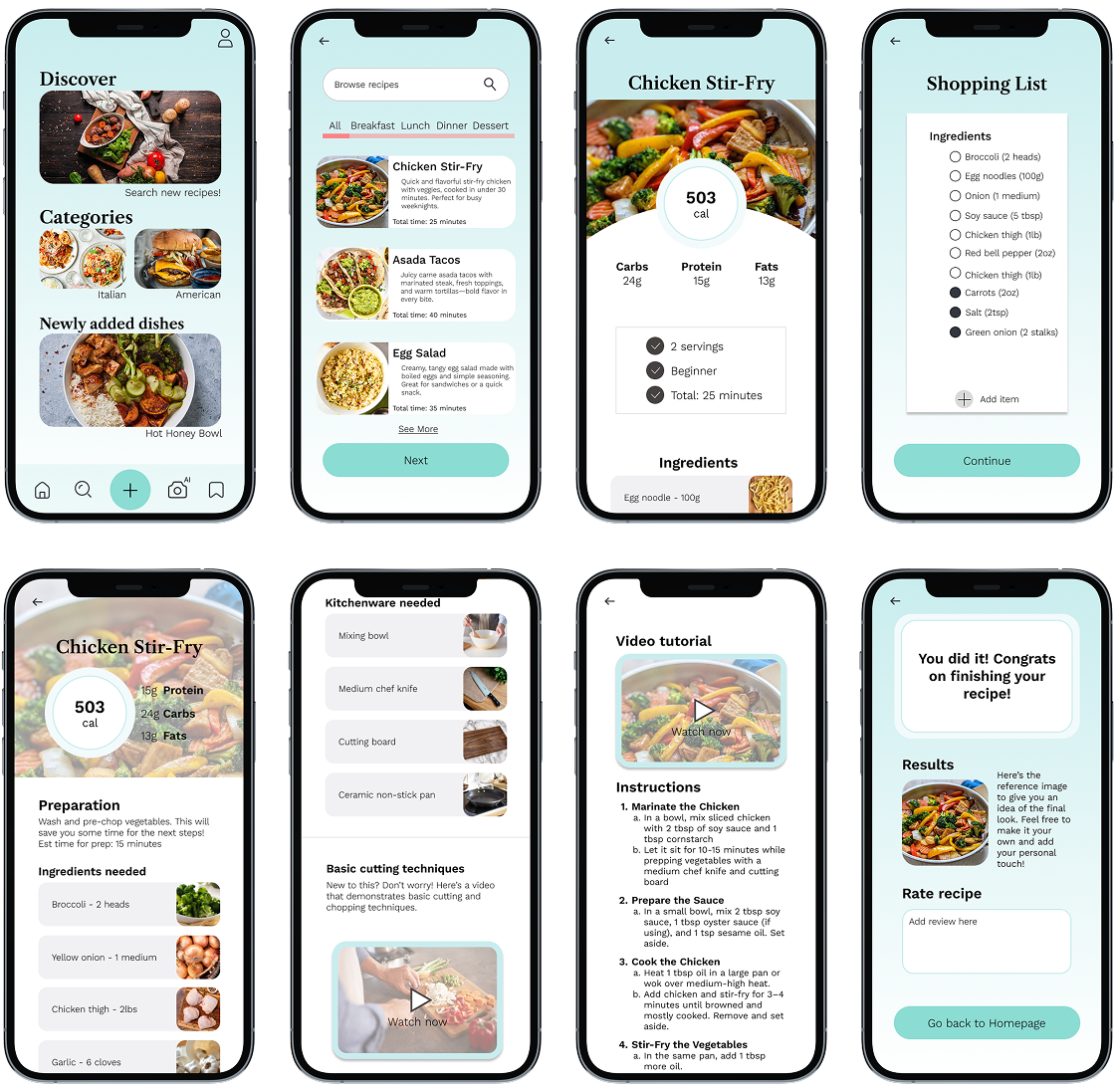
The first route guides users through browsing, selecting, and preparing meals from a curated list of dishes. This flow supports users with key features like personalized categories, nutritional information, and a step-by-step walkthrough of both ingredients and kitchen tools needed. The process is enhanced by prep visuals, timers, and guided cooking instructions, helping reduce confusion and enabling users to confidently complete recipes without disruptions.
Red Route Two - Creating a Recipe
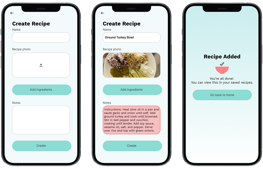
The second red route empowers users to add their own meals directly into the app. Users can upload images, list custom ingredients, write instructions, and save their personal recipes for future use. This route gives users creative control and flexibility while encouraging them to build a personalized digital recipe book. It’s especially valuable for users with family recipes or personalized meal plans, giving them a tailored space that still benefits from the app’s organizational tools.
Red Route Three - Using AI to Scan Meals
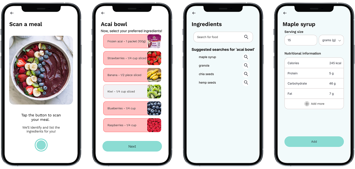
The third route introduces an innovative way to engage with the app. By simply scanning a meal photo, users can generate ingredient lists and even suggested recipes based on what’s detected in the image. This route is designed to support users who are visually inspired or uncertain about what’s in their dish. It encourages exploration, and bridges the gap between food discovery and practical meal planning. Altogether, these three red routes provide a flexible, user-centered framework that supports both creativity and convenience.
Day 5 - Validate
I interviewed 5 users who represented a range of cooking experience and perspectives:
Jess, a home cook who enjoys healthy meals and follows recipes 2–3 times a week.
Jake, a busy med student who cooks occasionally and values efficiency.
Chrissy, a new mom who needs clear, quick recipes with minimal prep.
Kevin, a foodie who likes experimenting and often critiques recipe clarity.
Emily, a beginner who finds online recipes intimidating and usually relies on friends or videos.
During the interviews, I asked each participant to walk through the prototype and think aloud as they interacted with it. I took notes on how they responded to the flow, visuals, and features like timers, prep views, and shopping lists. Most sessions lasted 15–20 minutes and were done virtually. I made sure to ask follow-up questions to understand what worked, what was confusing, and how they’d imagine using the app in real life.
Summary of Findings
Clarity and breakdown of steps were highly appreciated.
Users liked how each instruction was separated and supported with visuals.
The prep screen before cooking helped reduce stress, especially for newer cooks like Emily and Chrissy.
The shopping list feature and store suggestions were seen as useful and time-saving.
Some users wanted more flexibility. For example, the ability to adjust serving sizes or swap ingredients.
A few mentioned they’d love an optional voice feature or video preview for more guidance.
Users responded positively to the simplified, guided approach. One strong insight that stood out was how much confidence they gained from knowing what to expect before starting and having one clear step in front of them during the cooking process. This confirmed that the app was helping remove stress and confusion, which is the exact problem I set out to solve.
Conclusions and Key Insights
This Design Sprint revealed how much users value clarity, structure, and emotional support in their cooking experience, especially when trying something new. The current state of recipe platforms often leaves people feeling overwhelmed, under-informed, and distracted, forcing them to switch between apps, tabs, or videos just to make sense of basic steps.
Through user interviews, sketching, and prototyping, I found that breaking down recipes into digestible, visual, and well-timed steps helps users feel more confident and in control. Features like ingredient prep views, integrated timers, and shopping lists weren’t just convenient, they created a sense of being guided and supported, almost like having a calm, experienced friend in the kitchen.
One of the biggest takeaways was that solving for clarity and simplicity doesn’t mean removing depth. It means delivering information at the right time and in the right format. By focusing on reducing extra unnecessary steps and cognitive overload, the Simply Recipes app concept proved it’s possible to transform cooking into a smoother, more enjoyable experience.
The process also reinforced the importance of designing with empathy: meeting users where they are, whether they’re beginners or seasoned cooks. This sprint has shaped a strong foundation for moving forward with further iterations, usability testing, and deeper integration of personalization and accessibility features.