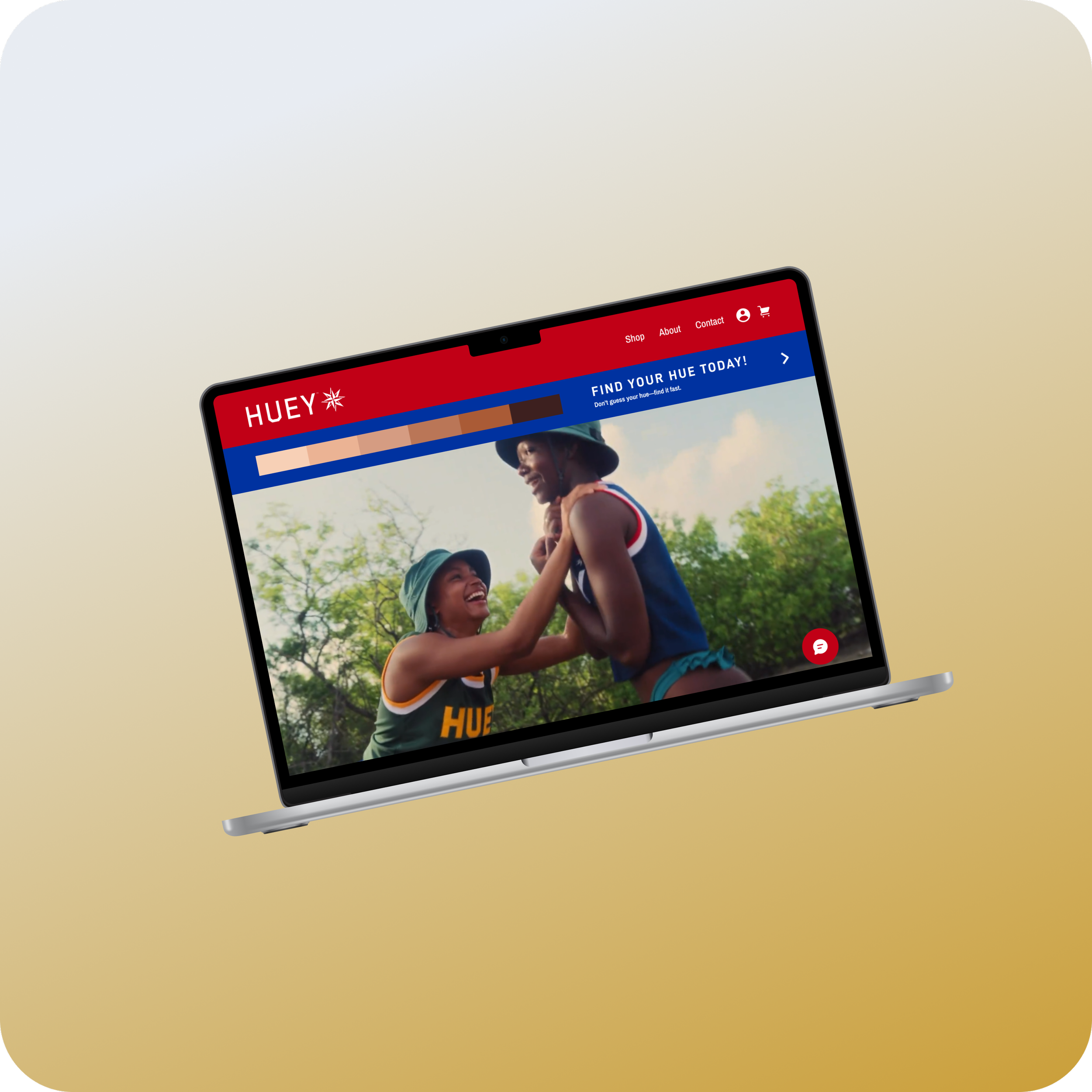

My Role
I owned the end-to-end product design for Huey Suncare, translating complex sun-care education into a clear, personalized digital experience. My work spanned user research synthesis, UX strategy, wireframing, interaction design, and high-fidelity UI - partnering closely with stakeholders to align user needs, brand identity, and business goals.
I focused on designing intuitive user flows, strengthening visual hierarchy, and introducing AI-driven guidance to help users confidently find sun-care products tailored to their skin and lifestyle.
Duration
July 2025 - September 2025 (3 months)
Team
UX/UI Designers: Ireland Mak, Danny Truong, Emily Sayer, Henri Ni
Tools
Figma, Miro, Google Docs
Scope
UI/UX, User Flow, Site Map, Competitive Analysis, Wireframing, Low-Fidelity, High-Fidelity, A/B Testing, Prototyping
CRAFTING AN INTUITIVE DIGITAL EXPERIENCE FOR SUN CARE
The Right Sunscreen Shouldn’t Be a Guessing Game
Huey Suncare’s existing online presence didn’t effectively communicate their brand story or guide customers toward purchasing. The brand needed a centralized, visually cohesive website that could showcase their products, educate users on sun care, and create an effortless transition from browsing to checkout.
After reviewing and finalizing the high-fidelity prototype with the design team and our stakeholder, I collaborated closely with team members to ensure the design system and screens were consistent and ready for development across different devices.
Kickoff
What Sunscreens Aren’t Saying
The current sun care market lacks personalized, performance-focused sunscreen options tailored to diverse skin types and activities. Most brands offer generic products that don’t address specific needs like preventing sun fatigue or enhancing athletic performance. Huey Suncare fills this gap by positioning sunscreen as a functional tool designed for active lifestyles, emphasizing science-backed, skin hue–based solutions rather than broad inclusivity.
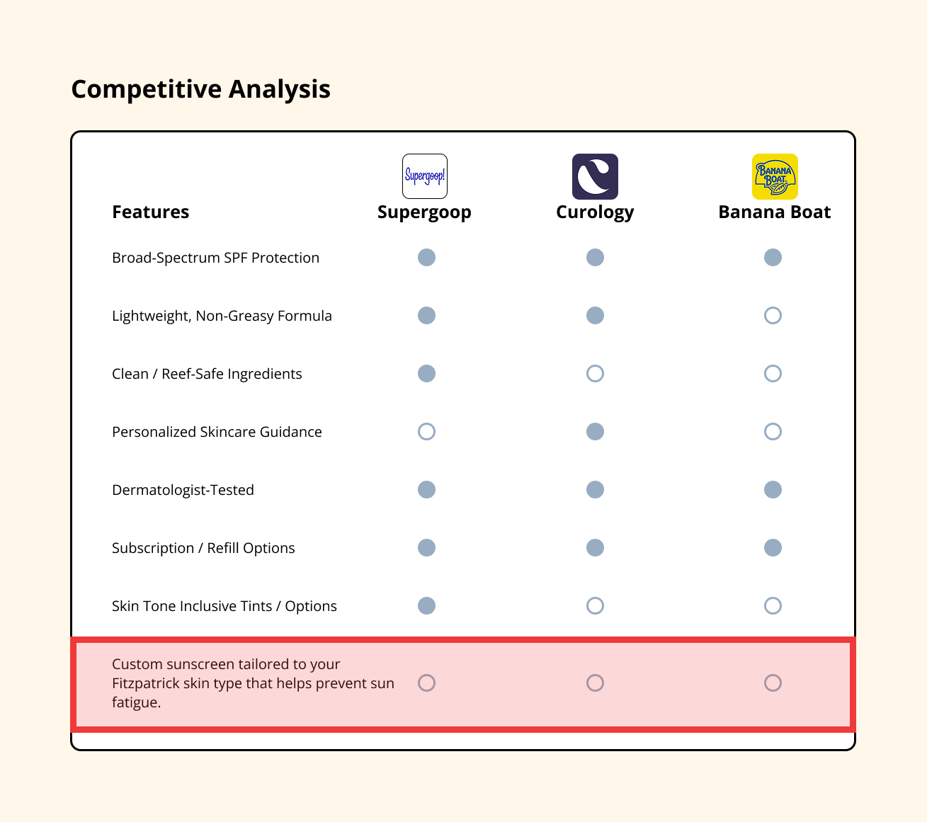
To further refine Huey’s direction, I analyzed competing sunscreen brands to uncover where they excel and where they fall short. This revealed an opportunity for Huey to stand apart through its nautical-inspired branding, clear communication, and focus on mineral sunscreen, while addressing gaps in personalization, education, and product fit.
Unique Solution
Huey Suncare leverages personalized skin hue matching and performance-focused product recommendations to engage active users. Differing from typical sunscreen brands, Huey offers a clean, intuitive website with tailored product flows, an informative design system, and interactive features that help users find the right sunscreen based on their skin type and activity level.
Design Opportunity
As a new player in performance skincare, Huey Suncare has the potential to redefine how athletes approach sun protection. While the brand’s vision and product innovation are strong, its current digital presence lacks the engagement and accessibility today’s consumers expect.
Huey’s founder envisions an inclusive, high-performance brand built for athletes of all skin types, guided by the Fitzpatrick scale for accurate tone matching, and formulated to last longer between applications. By revamping the e-commerce experience and creating a digital platform that blends expert-backed education with personalized product recommendations, Huey can connect with diverse, active communities and set a new standard for inclusive sun protection.
Research
By breaking my research into the competitive landscape, users, and goals, I was able to connect the bigger market picture with real user needs. This framework made it clear where Huey could differentiate: aligning brand strengths with what users actually value in sunscreen.
Exploring The Space
I mapped the sunscreen journey for two groups: athletes and everyday users across three moments: gearing up, on the move, and post-activity. Patterns popped fast: people are unsure which SPF to use for different conditions, when to reapply, and how to avoid white-cast with mineral formulas. Competitors offer plenty of products, but guidance is scattered. This gap shaped Huey’s role: become the clear, field-tested guide, not just another bottle on the shelf.
HOW MIGHT WE...
How might we guide users (performance athletes/individuals) who are unfamiliar with suncare toward personalized product recommendations that fit their skin and lifestyle needs?
Themes
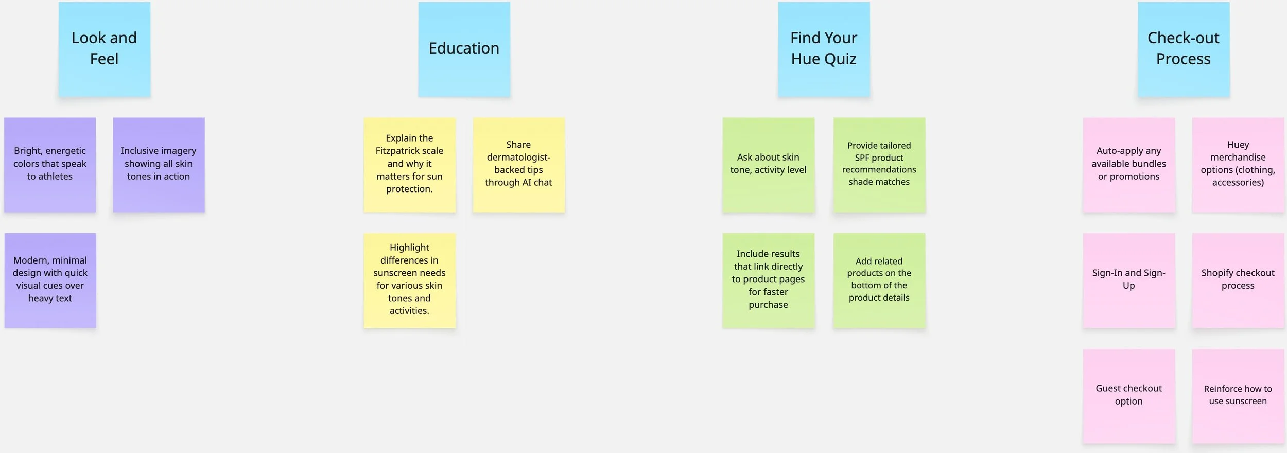
As I synthesized research, I mapped insights onto sticky notes and began clustering them into patterns. What emerged were four clear themes that would guide Huey’s design direction.
Look & Feel – Users wanted a brand that felt authentic and approachable, not overly polished or clinical. The design needed to strike a balance between trustworthiness and personality.
Education – Many people lacked clarity on how sunscreen actually works—when to apply, how often, and what makes mineral different. Clear, straightforward education became a priority.
Find Your Hue – A major barrier was uncertainty in choosing the right shade and finish. Users wanted proof through real-skin examples and an easy path to discover their match.
Checkout Process – Even when users found the right product, a complicated checkout risked losing them. Simplifying the flow was essential to build confidence and keep momentum.
Actionable Insights
What Research Taught Us About Sun Care
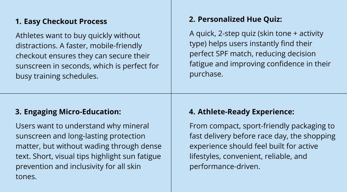
What stood out in my research is that most sunscreen brands sell a bottle. Huey sells readiness. Its nautical, military-inspired identity carries through in its clarity and discipline.
With the upcoming Hues line, Huey doesn’t just promise long-lasting mineral protection, it offers confidence that what you put on at mile one will still protect you at mile ten. The experience had to communicate that same sense of assurance.
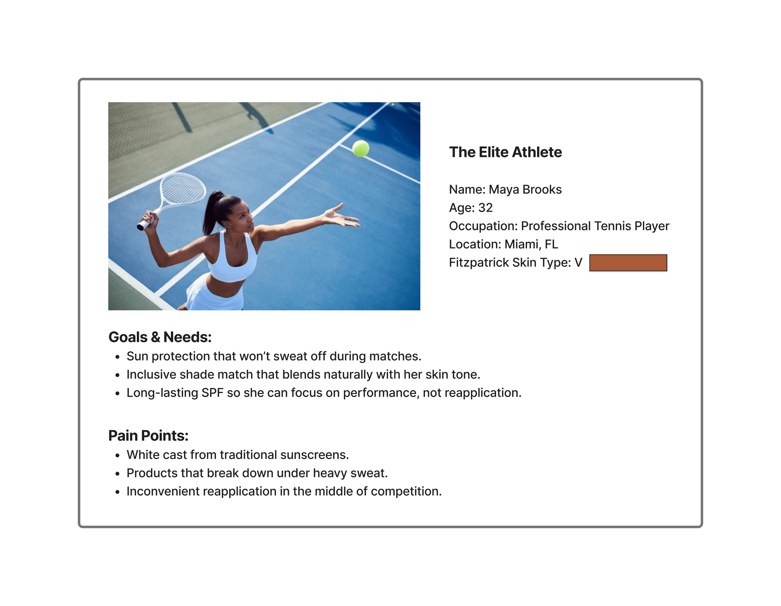
Meet The Users
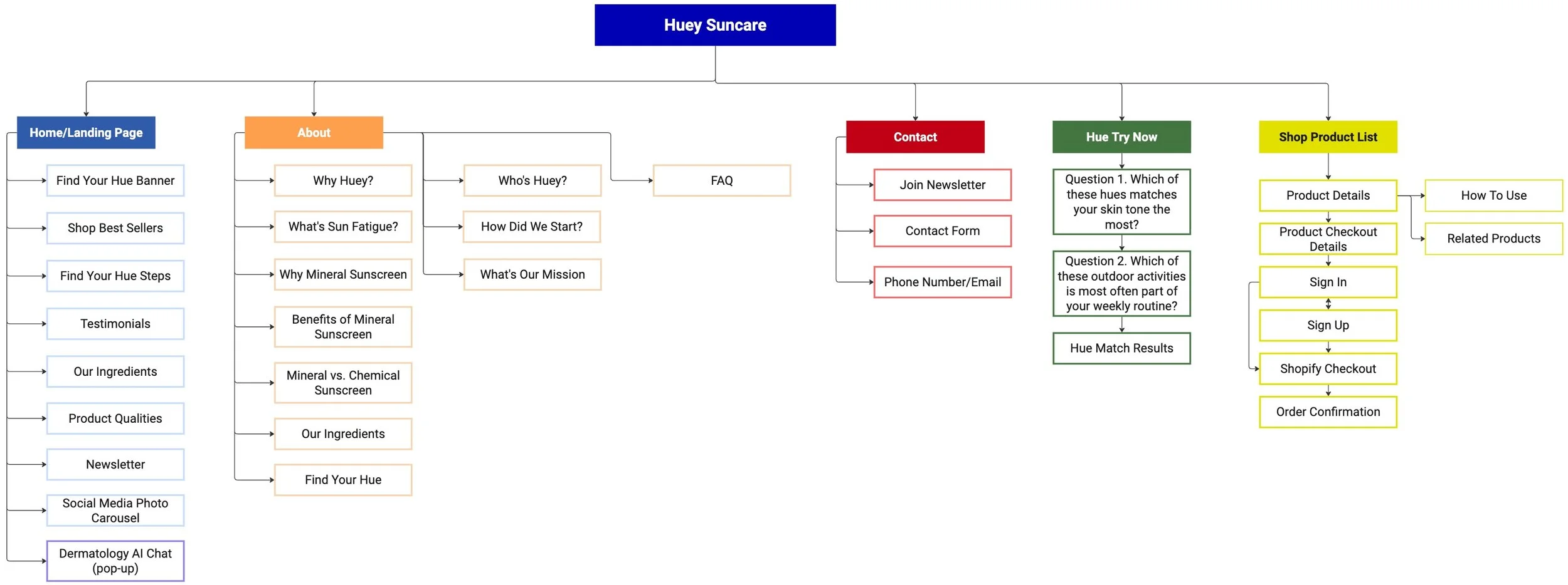
User Flow and Site Map
Key User Flows
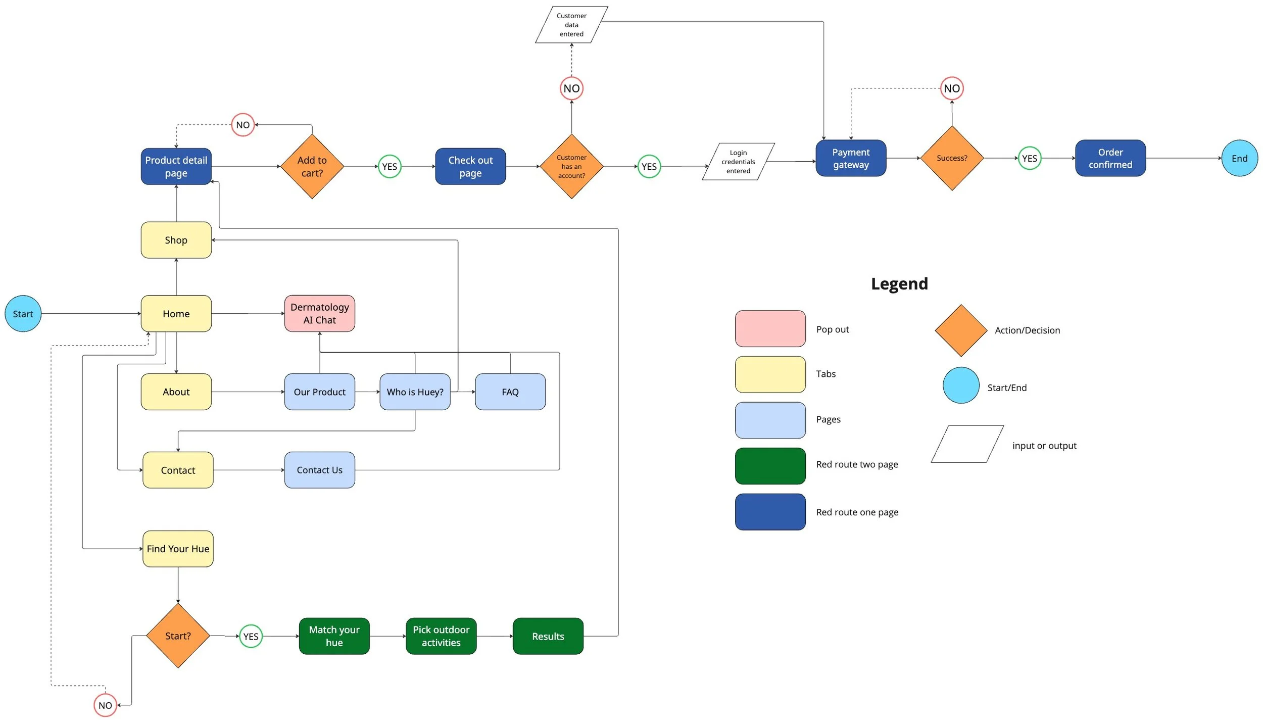
Two red routes define Huey’s experience: the Hue Quiz and the Shopping/Purchase flow.
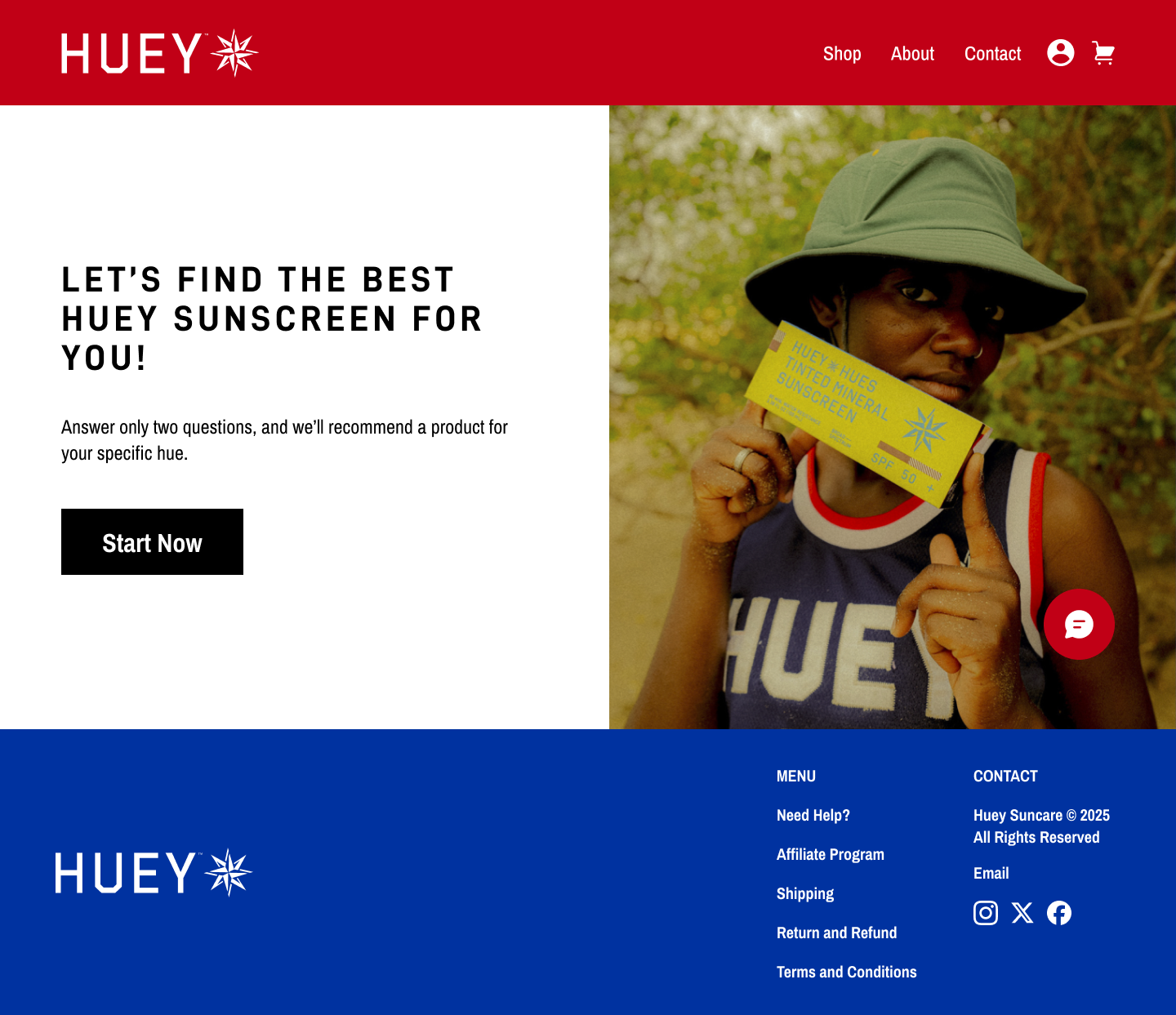
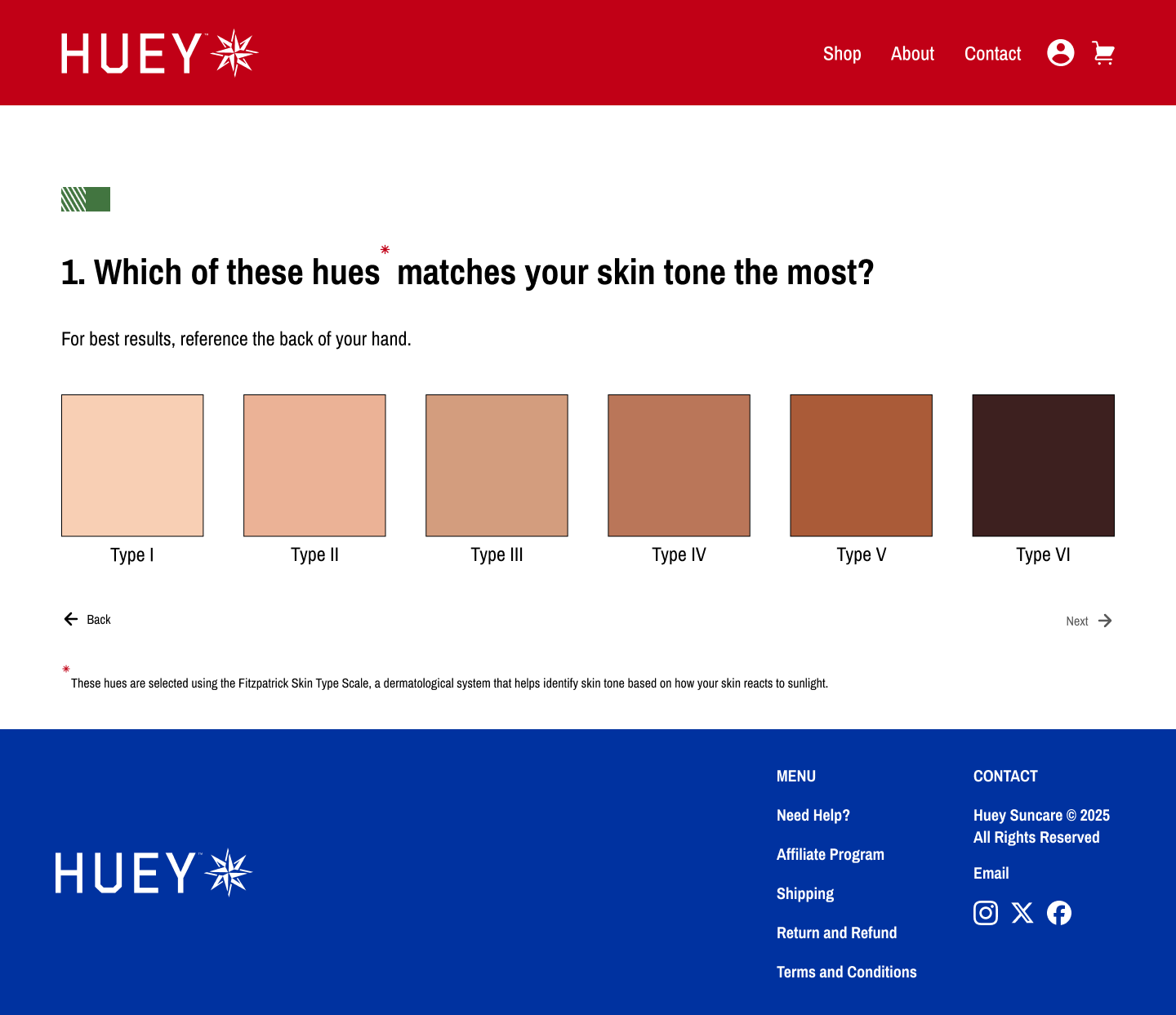
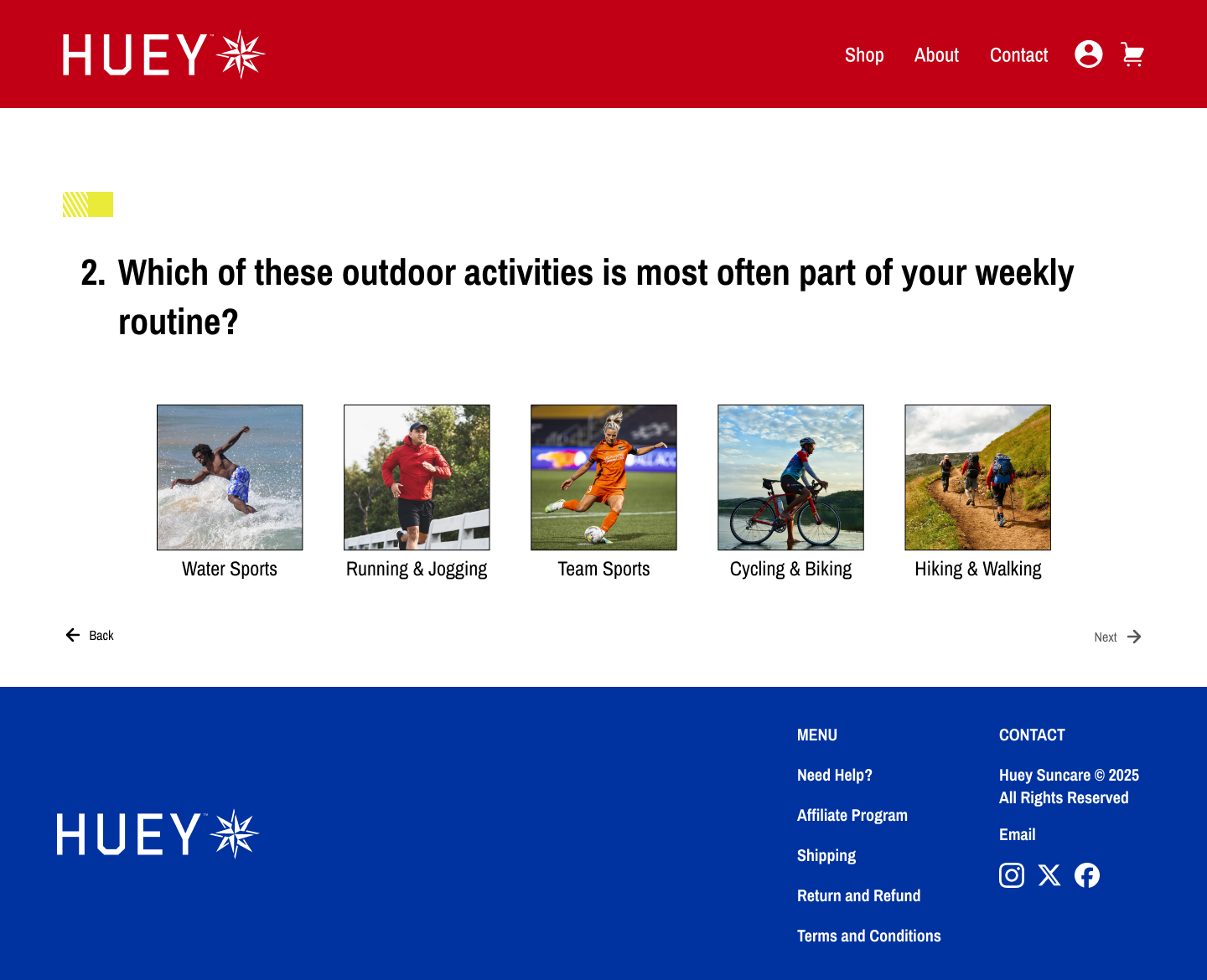
The Hue Quiz is the on-ramp. In just a few steps, users match their skin tone and outdoor activity to tailored product recommendations. It transforms uncertainty into clarity by replacing “Which one should I buy?” with “This is made for me.”
The Shop to Buy flow then carries that momentum forward. By streamlining product details, surfacing real-skin examples, and keeping checkout simple, the flow builds trust and keeps users moving with confidence.
LOW-FIDELITY PROTOTYPE
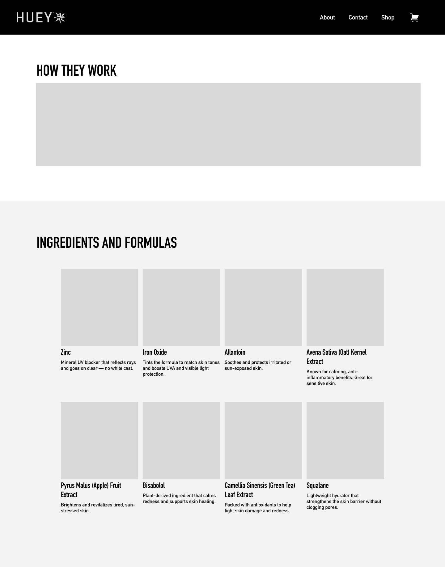
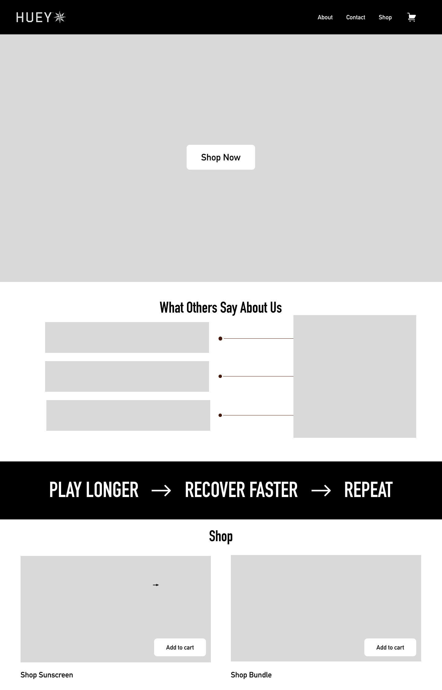
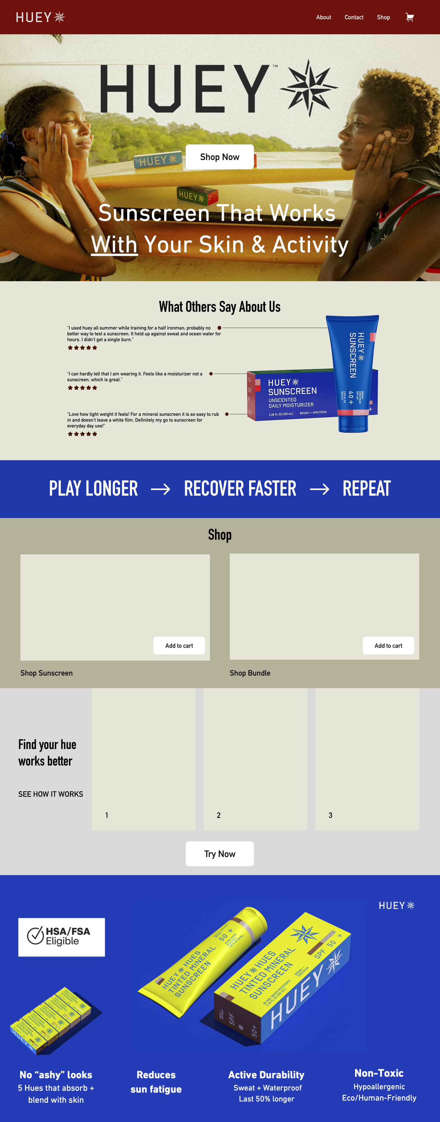
Just like sunscreen creates the first protective layer, our wireframes created the first design layer. These wireframes acted as blueprints to map out how users would shop sunscreen, understand how it works, and build trust through reviews. By prioritizing hierarchy first, we set the stage for a user-friendly and engaging experience.
Blueprints for Sun-Care Discovery: The Foundation of Huey’s Journey
Homepage
In my early wireframes for Huey Suncare, I focused on laying the foundation for a clear, supportive shopping experience.
The homepage was designed to immediately orient users showing direct paths to the Hue Quiz or product categories, giving people a sense of direction right away.
About
The About page served as a credibility layer, introducing Huey’s mission and mineral-first focus in plain, approachable language.
Quiz
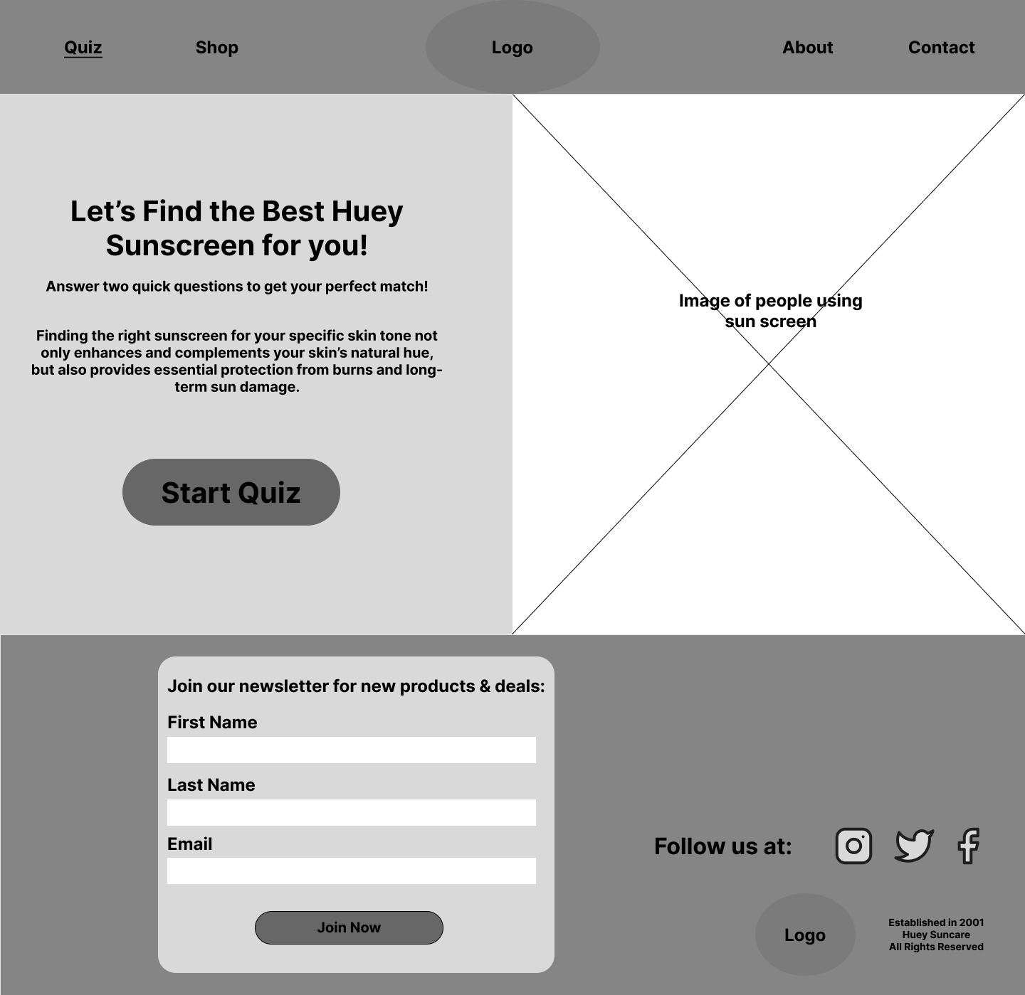
The Hue Quiz page became a central piece of the flow. Its wireframes emphasized speed and clarity: a few simple questions leading to tailored recommendations, cutting through the common uncertainty of choosing sunscreen.
Shop
Finally, the Shop page was structured for efficiency, with product cards that surfaced key details (SPF, wear time, finish) up front, helping users compare and commit without extra clicks.
Before
Low-Fidelity
After
High-Fidelity
A/B Testing
To refine Huey’s design choices, I conducted A/B testing on key elements of the site to better understand what resonated with users and what built the most trust.
1
2
3
Design System
1
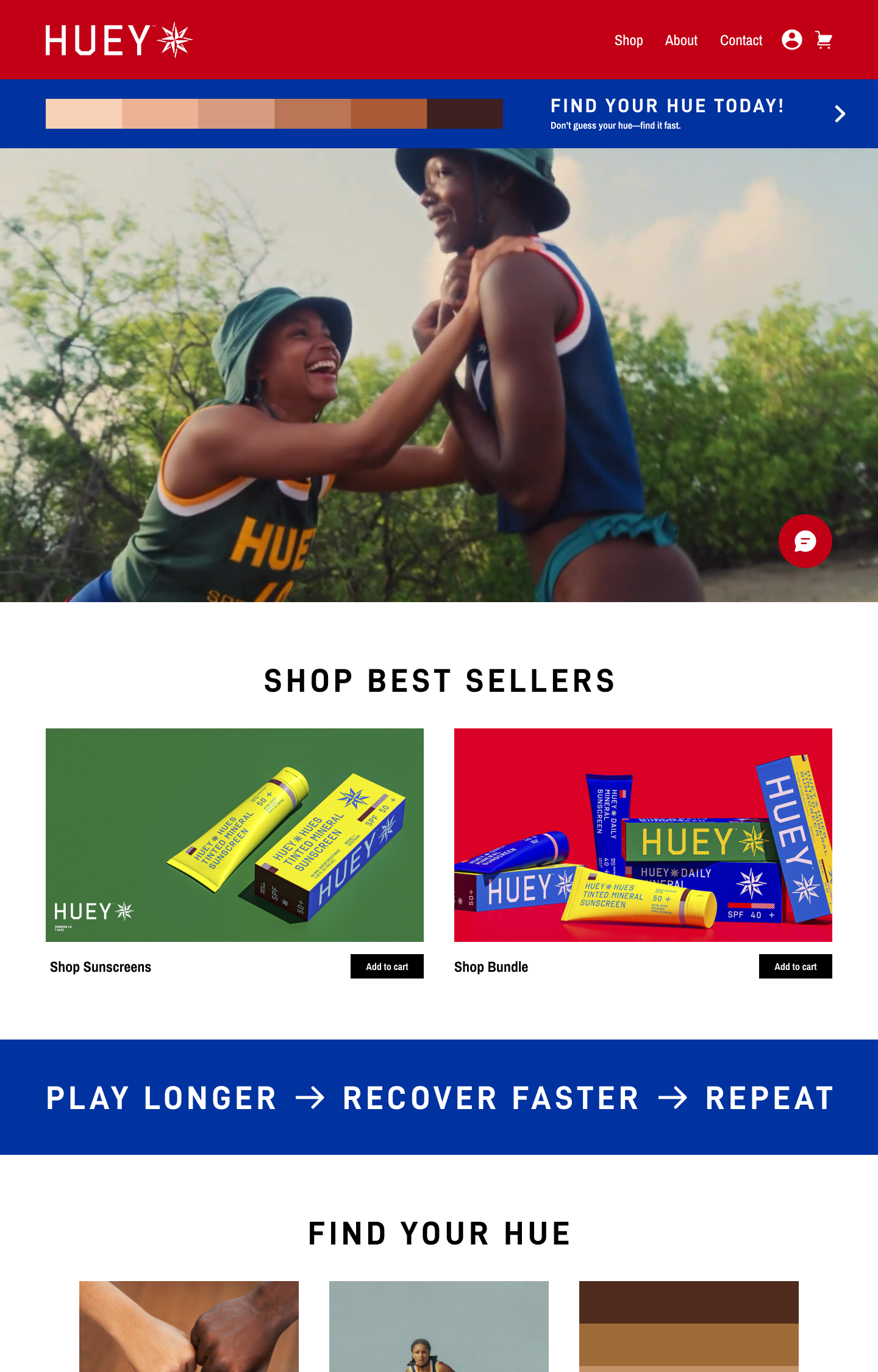
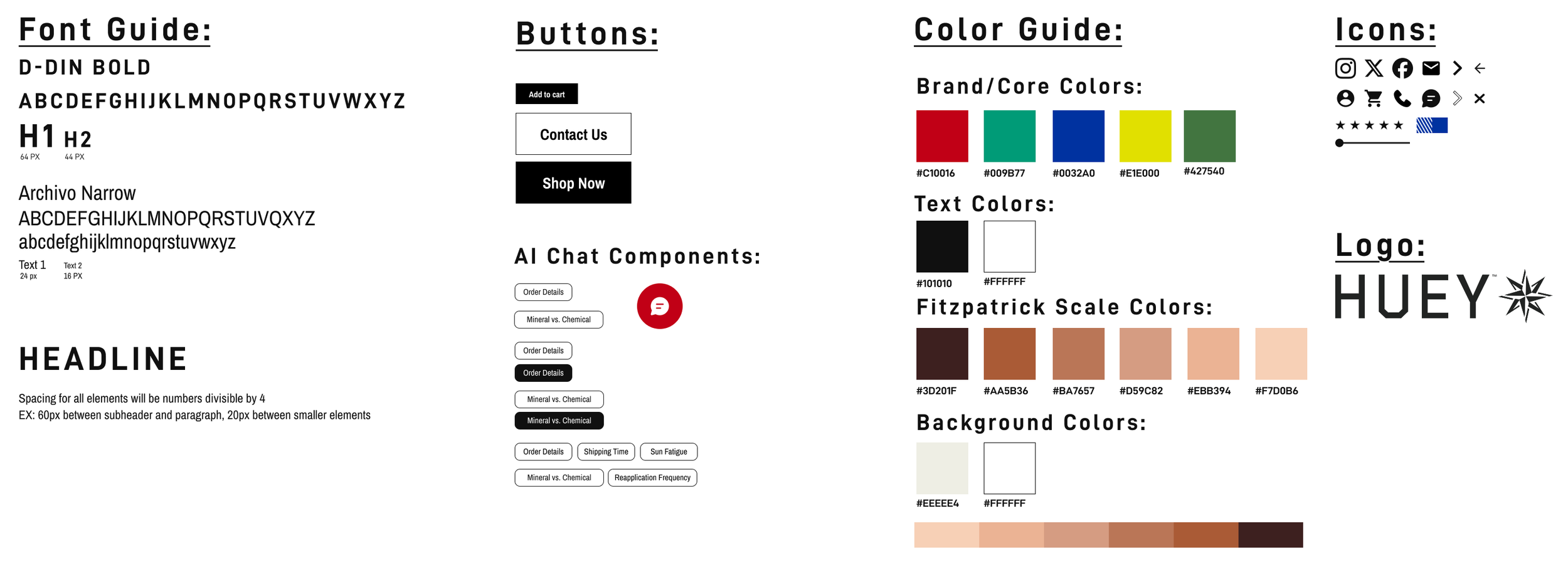
We compared a muted red bar with Huey’s brighter, bolder palette. The muted version was our initial concept to help highlight the brands bright bold colors. However, user feedback and stakeholder input revealed that the brighter version created a more positive reaction. It felt light, energetic, and exciting, sparking the sense of discovery we wanted users to experience with Huey Suncare. This insight pushed us to fully embrace the bold reds, blues, yellows, and greens, staying true to the brand identity while creating a more engaging first impression.
Visual Hierarchy
2
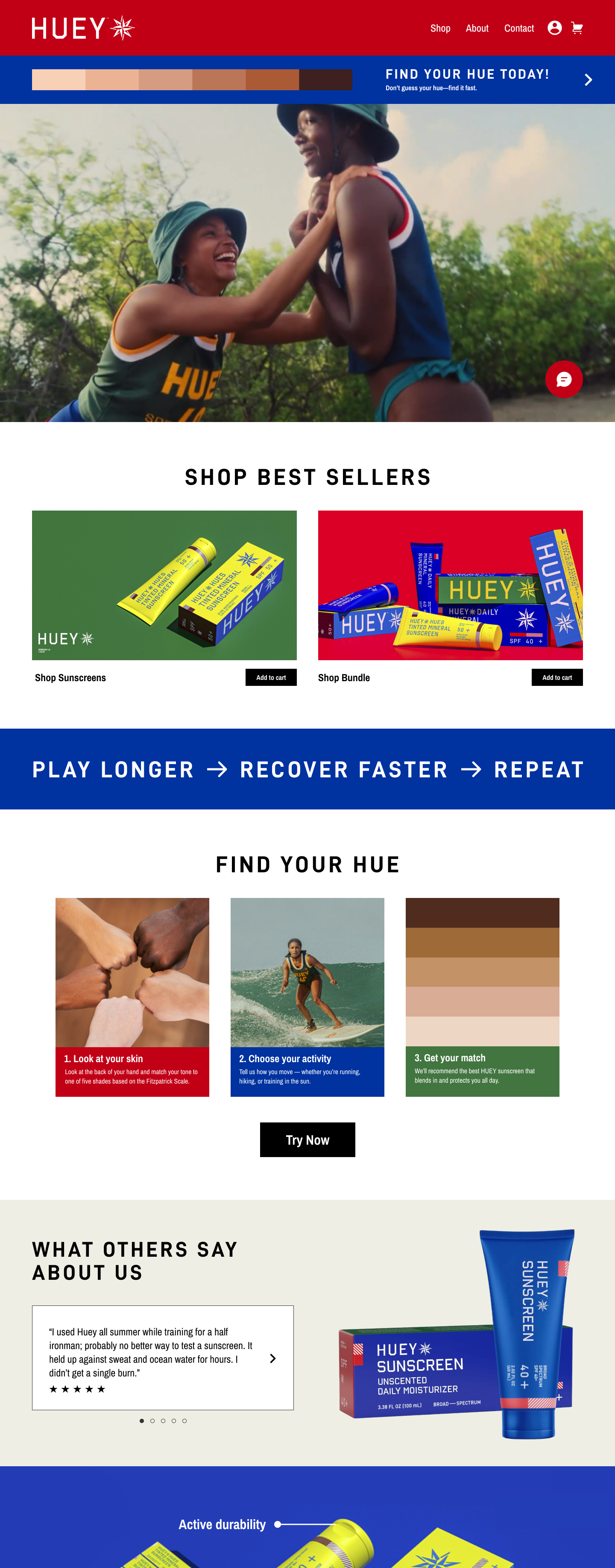
On the homepage, we prioritized the visual hierarchy to guide users effectively. At the very top, we placed the “Find Your Hue” quiz within a slim banner. Its lightweight design ensures it’s visible immediately without taking over the page, while giving users control with the option to dismiss it if they’re not interested. Below that, the flow highlights “Shop Sunscreen/Bundles,” followed by “How It Works,” and then the reviews section. In testing, the carousel layout for reviews performed best showcasing multiple voices, building trust, and reinforcing credibility without overwhelming the page. Altogether, this structure creates a clear, goal-driven experience that balances guidance with user choice.
AI Chat Accessibility
3
Accessibility was another key focus during testing. By ensuring the chat icon remained available across all pages, users felt more supported and confident navigating the site. This small detail proved essential for usability, showing that direct access to help enhances trust and overall experience.
PAIN POINT
Beyond AI Customer Service
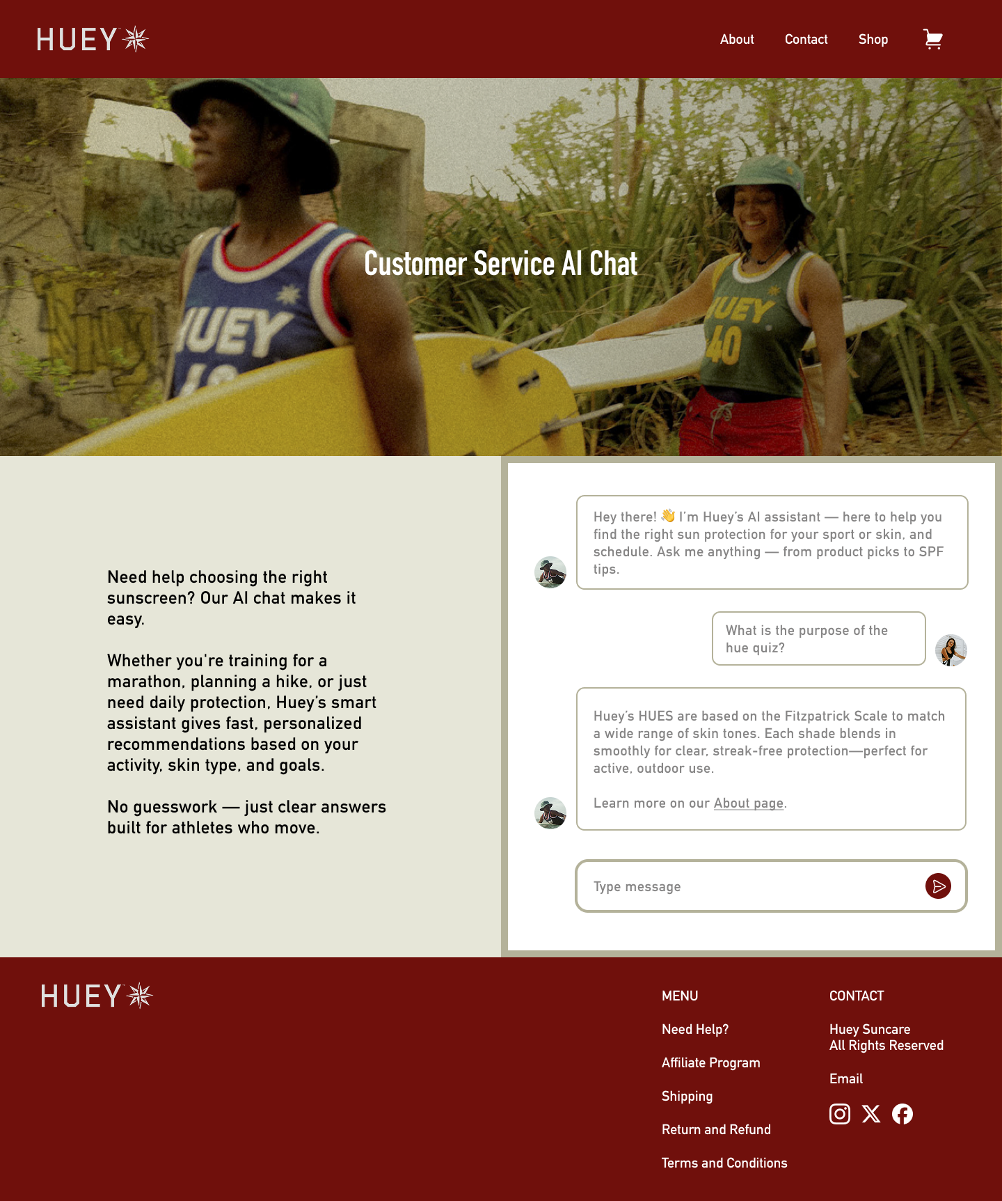
Originally, the chat function served primarily as a customer service tool to answer shipping inquiries and order questions. While functional, it left a gap: users seeking guidance on sunscreen, skin types, and personal needs had no tailored support, making product discovery feel impersonal and overwhelming.
Original Concept
By transforming the chat into an AI-driven dermatology assistant, we bridged this gap, creating a unique touchpoint that goes beyond generic responses.
Users could now ask skin-specific questions, explore product recommendations based on their personal needs and Huey’s offerings, and receive guidance that felt informed, credible, and instantly accessible. This turned a transactional interaction into an educational and personalized experience.
New Concept
Impact
Education and Personalization: Helped users quickly understand sunscreen terms, product differences, and which options best fit their skin type and lifestyle.
Trust and Accessibility: Always-available AI chat reinforced brand credibility and inclusivity, letting users feel supported without confusion.
Business Value: Guided users to the right products, improving confidence and driving conversions, while differentiating Huey from competitors with a unique, tech-forward experience.
HI-FI PROTOTYPE
Solution
The Final Layer: A Sun-Care Experience That Shines
Homepage
The homepage was designed with a clear visual hierarchy, prioritizing the sunscreen bundles and “How It Works” section before introducing user reviews. This structure guided users naturally from product discovery to trust-building, reducing decision fatigue.
Red Route One - Find Your Hue Quiz
Find Your Hue Start
Question 1
Question 2
Results
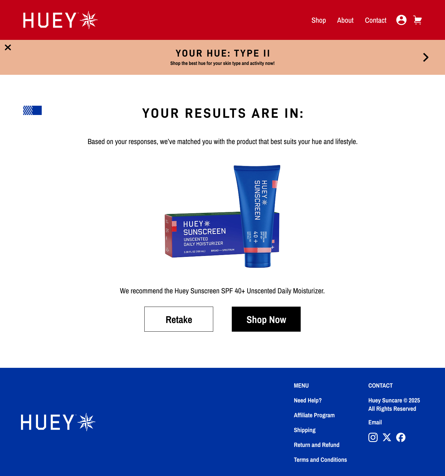
The “Find Your Hue” quiz was crafted as a personalized entry point, helping users quickly identify the right sunscreen shade for their skin tone and lifestyle. This not only simplified decision-making but also reinforced Huey’s brand identity as approachable and user-centric.
Red Route Two - Checkout
Product Details and Add-To-Cart
Sign In or Sign Up and Shopify Checkout
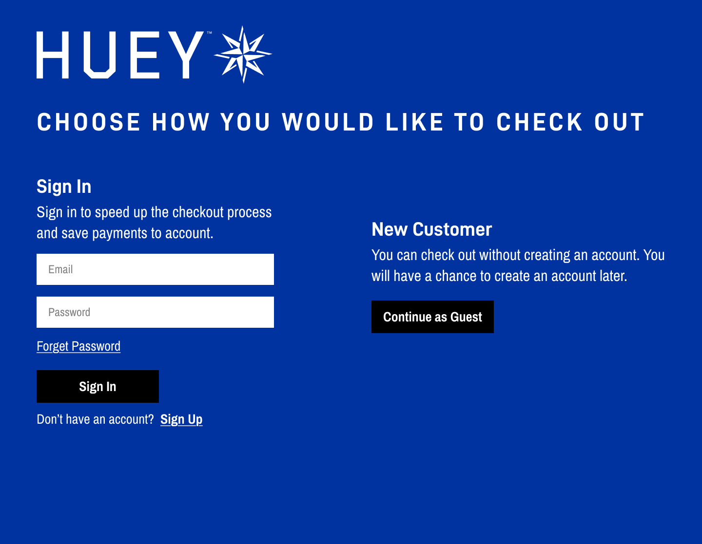
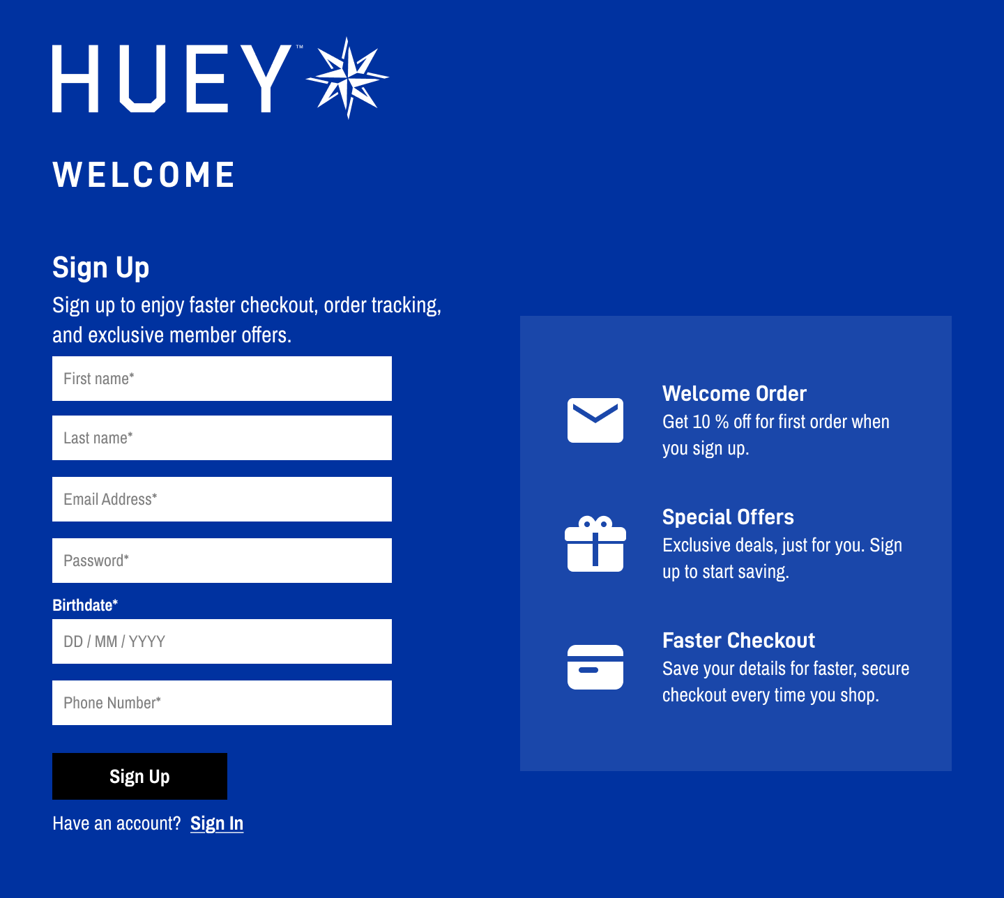
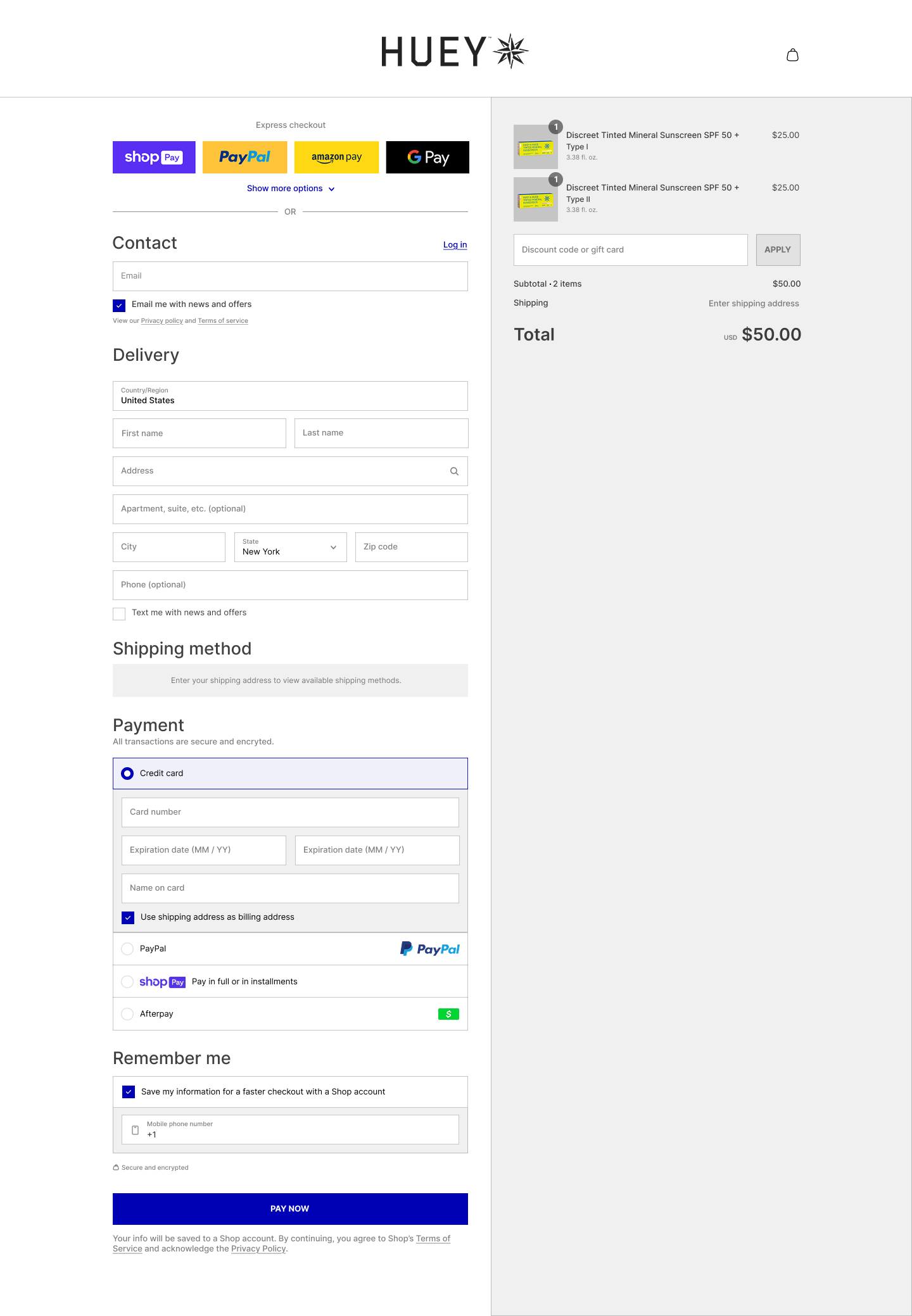
The shopping experience emphasized clarity and ease, with well-structured product pages, bundle options, and seamless checkout. This flow removed unnecessary friction and aligned with the goal of converting interest into confident purchases.
Final Prototype
Visual Identity
Key Insights and Takeways
This project, though short, became one of the most memorable experiences I’ve had as a designer. Collaborating closely with three other designers and our stakeholder challenged me to balance creativity, brand vision, and user needs in a fast-paced environment. Through research, ideation, and A/B testing, I discovered how central color and visual identity were to conveying Huey Suncare’s energy and excitement.
From the start, our goal was clear: bring Huey Suncare’s brand identity to life in a way that was bold, exciting, and user-friendly.
If I had more time, I would have expanded user testing to gather deeper, more diverse insights. While I gathered valuable feedback from two users and our stakeholder, conducting 5–10 interviews would have given me a stronger foundation for decisions and added more rigor to this case study. Hearing directly from a wider set of users would have revealed patterns in behaviors, preferences, and pain points, making the design outcomes even more user-centered. Future iterations of this project could refine the experience further, ensuring Huey’s bold, playful identity not only looks exciting but also deeply resonates with its target audience.
What I Would Change If I Had More Time
This project reaffirmed the power of thoughtful design decisions further proving that even small details, when grounded in user feedback, can transform a product into a brand experience that feels both trustworthy and unforgettable.


