

Upmile: A Beginner-First Running Experience with Personalized Milestones
My Role
As the lead UI/UX Designer on Upmile, I drove the vision for a beginner-friendly running app that lowers the barrier to entry for new runners. I led the full design process from foundational research and competitive analysis to information architecture, interaction design, and high-fidelity prototyping.
With my background in healthcare, I utilized a strong lens of empathy and accessibility, making sure the experience felt supportive rather than intimidating. I translated user insights into clear design decisions, facilitated usability testing, and refined the product to create an experience that helps users build healthy routines with confidence.
Duration
2 months
Overview
Upmile is a mobile experience designed to support people who want to start running but often feel overwhelmed, unsure where to begin, or discouraged by existing apps built for experienced athletes. I conducted end-to-end UX work to bring this concept to life. I carried out user interviews, synthesized pain points, mapped the running journey, and prototyped a personalized, milestone-based system that adapts to each runner’s pace and motivation.
Tools
Figma, Miro, Google Docs
Scope
UI/UX, Secondary Research, User Flow, Competitive Analysis, Affinity Mapping, User Interviews, User Personas, Wireframing, Guerrilla Testing, Style Guide, Low-Fidelity, High-Fidelity, Prototyping
PROBLEM
New runners struggle to find structure, motivation, and trusted guidance when starting
As someone who’s worked in healthcare and spoken with patients about lifestyle changes, I’ve seen firsthand how intimidating it can be for people to begin a new fitness habit, especially running. Personally, I’ve also experienced how challenging it is to stay motivated without a clear plan, encouragement, or understanding of what’s “normal” when starting from scratch.
Most beginner runners turn to apps for help, but many existing solutions are tailored toward experienced users or those already in shape. The tone is often data-heavy, the plans rigid, and the advice too generic. This creates confusion at the very first step before users even lace up their shoes.
Research Highlights
Research pointed to a consistent gap in support for new runners
A 2023 survey from Running USA reported that nearly 65% of new runners drop off within the first month due to injury fears, unclear plans, or lack of motivation.
Most fitness apps prioritize performance metrics over emotional support, which alienates those just trying to build a habit.
Beginner users are also 4x more likely to abandon fitness apps that don’t explain gear basics or offer adaptable plans.
These insights helped shift my design lens away from traditional tracking tools and toward building an experience grounded in clarity, personalization, and emotional encouragement. These three elements are missing from most fitness apps for beginners.

RESEARCH
What Beginner Runners Are Missing
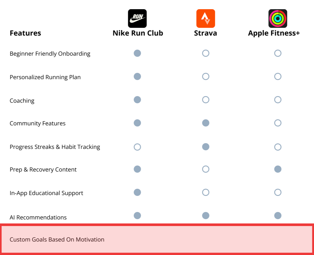
Competitor Analysis
Approach
Nike Run Club uses contact syncing and a closed chat system (only after mutual acceptance) to help grow trusted connections over random social engagement.
This aligns with their brand image—quality over quantity and exclusivity in performance and progress.
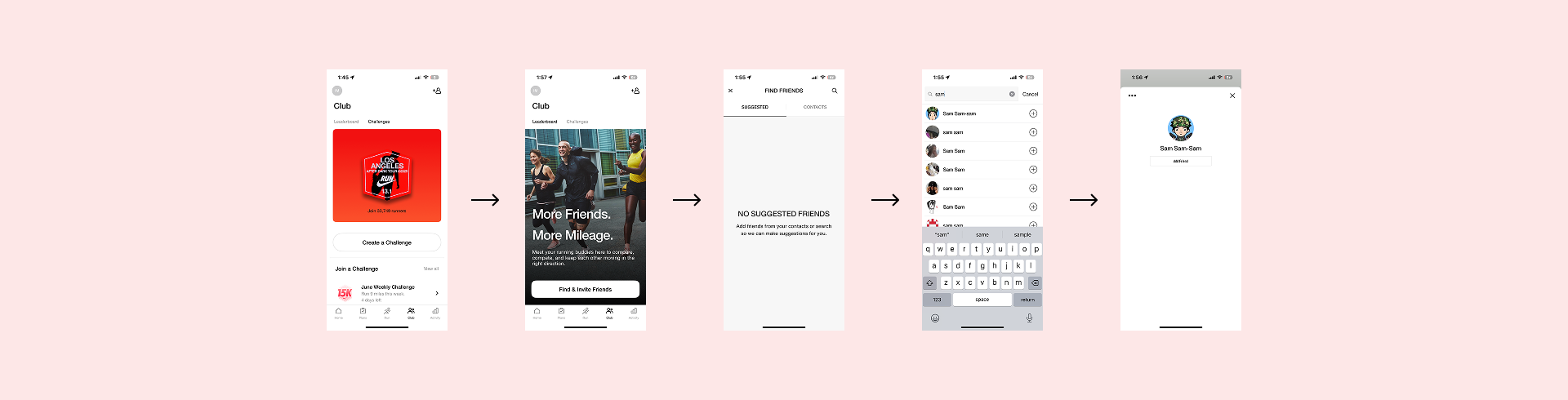
Nike Run Club
How well are they doing this?
Moderately successful. While it helps create a safer space, it limits organic or spontaneous social growth—especially for users looking to build new communities, not just stay connected with existing friends.
To further inform my direction, I studied leading industry apps to identify what they do well and where they fall short. This helped me define a solution that maintains their strengths while addressing gaps in accessibility, motivation, and beginner support.
Key Missing Features Across All Competitors:
Limited Gear & Prep Guidance
While many apps include training plans, few provide tips on gear, warm-ups, or injury prevention, which are all critical to starting safely and confidently.
→ Insight: Beginners need physical readiness to feel mentally prepared. Gear confusion can delay or discourage action.
Generic Plans, No Personalization
Apps like Nike Run Club or MapMyRun offer static programs with minimal input from users. There’s no customization based on fitness level, goals, or preferences.
→ Insight: Runners drop off when plans don’t reflect their individual needs or schedule.
Motivation Focused Only on Metrics
Apps often highlight distance, pace, and calories burned, but rarely acknowledge emotional milestones or first-time wins.
→ Insight: For beginners, motivation is emotional, not just numerical. Acknowledging effort is just as important as tracking output.
No Real-Time Feedback While Planning
Users reported confusion during plan setup, unsure if their selections impacted their actual schedule or progress.
→ Insight: Without clear feedback, users doubt the value of the tool and lose confidence in the plan.
How This Shaped My Design Strategy
What became clear through competitor analysis and testing was this: most apps assume users already run. They highlight stats, social feeds, and leaderboards. However they miss the before, the uncertainty, the prep, and the questions no one wants to ask. That’s where most beginners hesitate and where I decided to focus.
Step-by-Step Plan Builder → Breaking down plan creation into clear, manageable stages based on fitness level, schedule, and goals
Beginner Gear + Prep Hub → Providing short, visual resources that explain gear, stretches, and safety tips
Micro-Feedback + Emotional Wins → Encouraging users with milestone messages, progress reflections, and visible small victories
Real-Time Confirmation → Letting users preview and update their plan dynamically to feel more in control
Conversational AI Support → Giving users 24/7 help with a warm, coach-like tone and accessible guidance
SOLUTION
Support and Structure Drive Consistency
Personalization Through
Technology
New runners don’t just need a training plan, they need one that adapts to their fitness level, schedule, and personal goals. Personalized features help reduce uncertainty and make the journey feel achievable.
Step-by-step plan builders, responsive feedback, and visual progress summaries create a sense of clarity and ownership. Users can move at their own pace while still feeling guided and supported which is something generic apps often miss.
Runners are 76% more likely to maintain a habit when following a structured, personalized plan.
*According to Strava - Strava Year In Sport Trend Report: Insights on the World of Exercise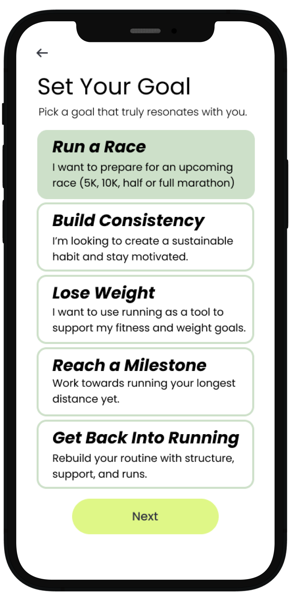
Building Confidence with the
Right Information
Confidence starts with preparation. Many users drop off due to lack of knowledge around gear, warm-ups, or injury prevention.
Motivation That Goes Beyond Metrics
Curated prep and recovery sections address these pain points by offering beginner-friendly videos, checklists, and quick tips.
When users feel physically and mentally ready, they’re more likely to stick with their plan and avoid burnout or injury. Giving them the right tools—at the right time—makes the process feel more approachable.
*According to Strava - Strava Year In Sport Trend Report: Insights on the World of Exercise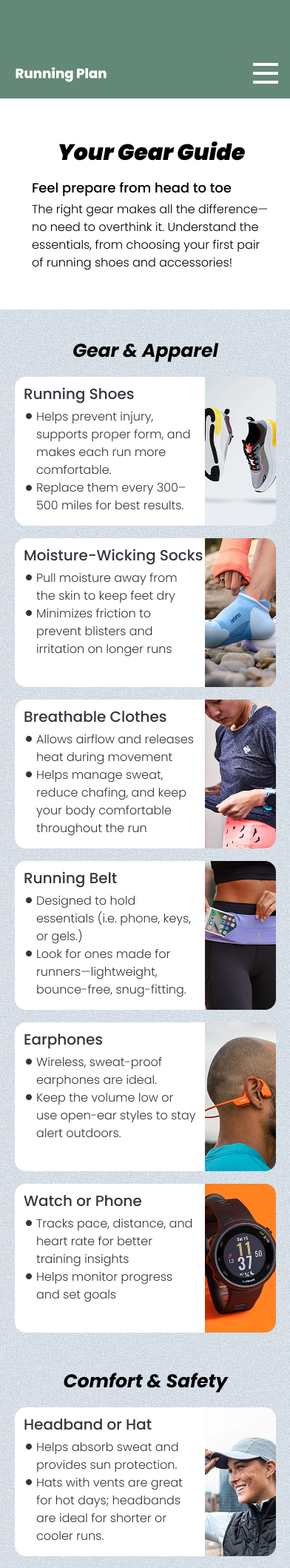
Progress isn’t just measured in pace or distance. For beginners, emotional motivation matters just as much, if not more than data.
Features like milestone badges, reflection prompts, and encouraging language help reinforce effort and build momentum.
Adding human-like AI support, journal prompts, and subtle celebrations gives users the feeling that their work is seen, valued, and worth continuing.

*Supporting Physical Activity Behavior Change with LLM-Based Conversational AgentsINSIGHTS
User Interviews
As someone who always wanted to build a consistent running habit, I often found myself starting strong—only to lose momentum within a few weeks. Whether it was choosing the wrong gear, running too hard too soon, or just not knowing where to start, the process felt scattered and discouraging.
Even when I followed online plans or tried fitness apps, the guidance often felt too generic or overwhelming. What I needed was something more structured, supportive, and beginner-focused—something that could meet me where I was and help me build confidence over time.
In the discovery phase, I spoke with beginner runners at various stages first-timers, casual joggers, and those returning after time off. What stood out wasn’t just their fitness level, but their mindset and motivations around running.
Some users, like Alyssa, felt overwhelmed by how to even start. She wanted someone to “just tell me what gear I need, how often to run, and what’s normal to feel.”
→ Confidence came from clarity, simplicity, and structured guidance.
Others, like David, had tried running before but struggled to stay consistent. He wasn’t focused on speed or performance—he just wanted to make running a habit that felt sustainable.
→ Consistency and emotional encouragement mattered more than performance tracking.
Users like Jason were goal-oriented but lacked direction. He was motivated by weight loss and race preparation but didn’t know how to train correctly.
→ These users needed a mix of accountability, structure, and progress visibility—without feeling pressured.
First and Seconds Rounds of User Testing
HOW MIGHT WE...
How might we empower beginners to start running with the guidance, confidence, and support they need to make it a lasting habit?
DESIGN
Early Ideation
In the early stages of ideation, I explored how a running app could go beyond basic tracking to truly support beginners. I focused on creating a guided experience: one that would offer education on gear, training plans tailored to different goals, and features that address the emotional and motivational challenges new runners face. These early concepts aimed to make running feel approachable, personal, and sustainable.
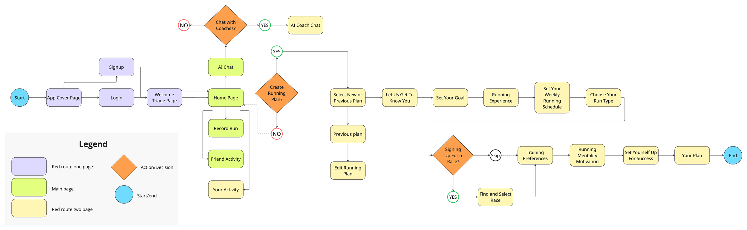
When designing the user flow, I wanted to create flexible starting points that reflect the different ways people approach running.
The first route is for users who want to build a completely new running plan that is ideal for true beginners who need step-by-step structure, goal selection, and pacing guidance. The flow walks them through key setup decisions like weekly schedule, running experience, and training preferences to generate a personalized plan.
The second route supports users returning to the app who may have taken a break. Instead of starting over, they can pick up a previously saved plan or adjust it based on their current pace or availability. This encourages long-term engagement and reduces the friction of re-entering the habit.
The third path introduces a conversational AI assistant, designed for users who need quick support, whether that’s help choosing the right plan, understanding gear, or asking questions like “how many times a week should I run?” This adaptive route gives users a lightweight, supportive experience when they’re feeling unsure or overwhelmed.
Overall, these three paths ensure the app is inclusive of different runner mindsets, whether they're starting fresh, returning, or exploring options, and sets the tone for a supportive and user-centered experience.
User Flow
Wireframing and Guerilla Testing
In my low-fidelity designs, I focused on creating a personalized and customized experience for runners. My goal was to provide just the right amount of information to help users feel confident and prepared without overwhelming them. By tailoring the app’s features to individual preferences and needs, I aimed to make each runner feel supported and equipped to reach their goals, whether they’re beginners or more experienced. This approach guided the layout and flow, ensuring simplicity while maintaining helpful guidance throughout the user journey.
Onboarding
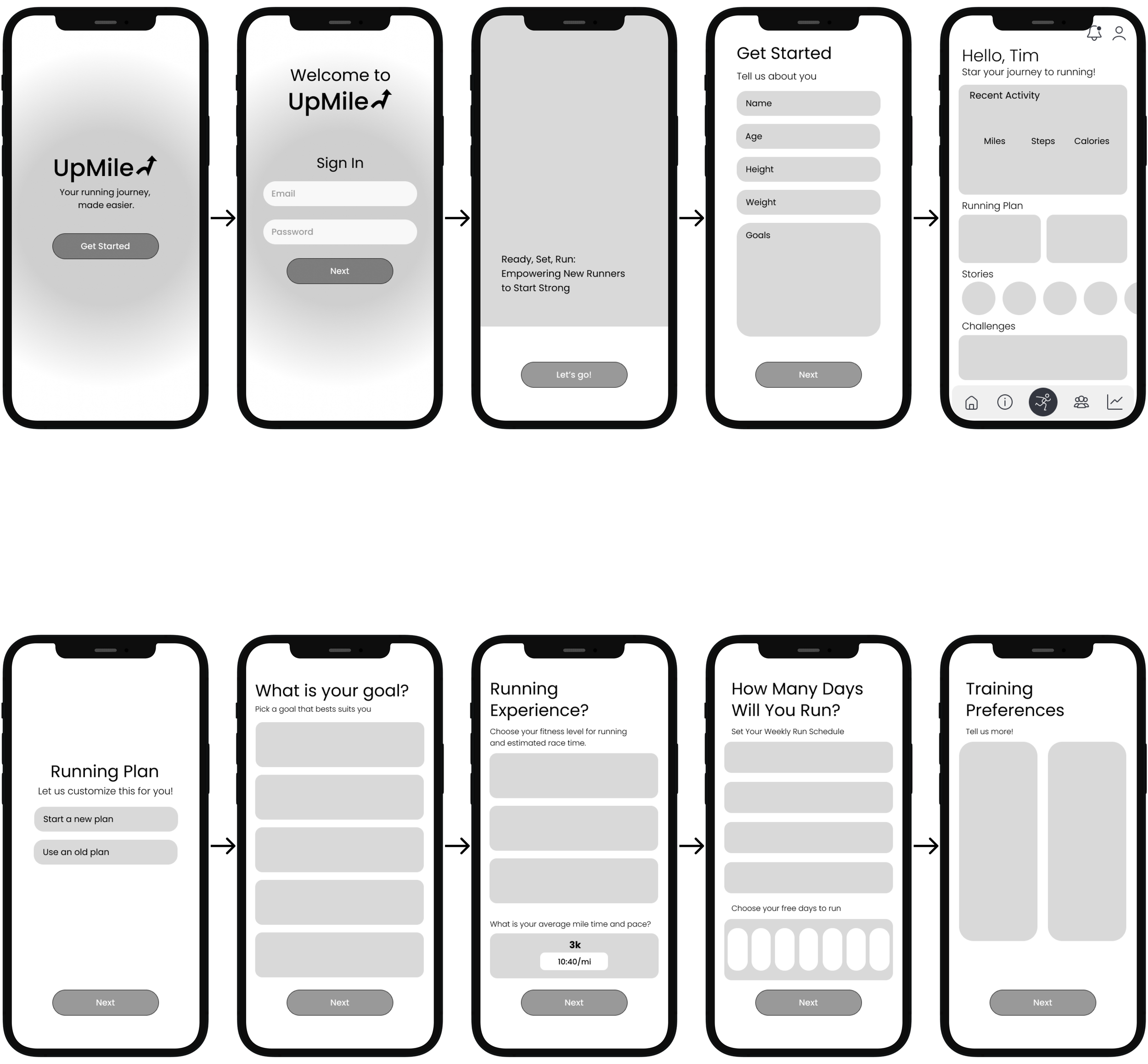
Create Running Plan
USER PAIN POINTS
Real-Time Stories: Building Connection and Urgency
User interviews revealed that sharing progress through stories is one of the most effective ways to maintain motivation and accountability.
Stories create a real-time connection among users, creating a sense of urgency to check the app frequently and stay updated on others’ activities.
This dynamic encourages ongoing interaction and builds a supportive community environment.

Challenges: Driving Motivation Through Social Incentives
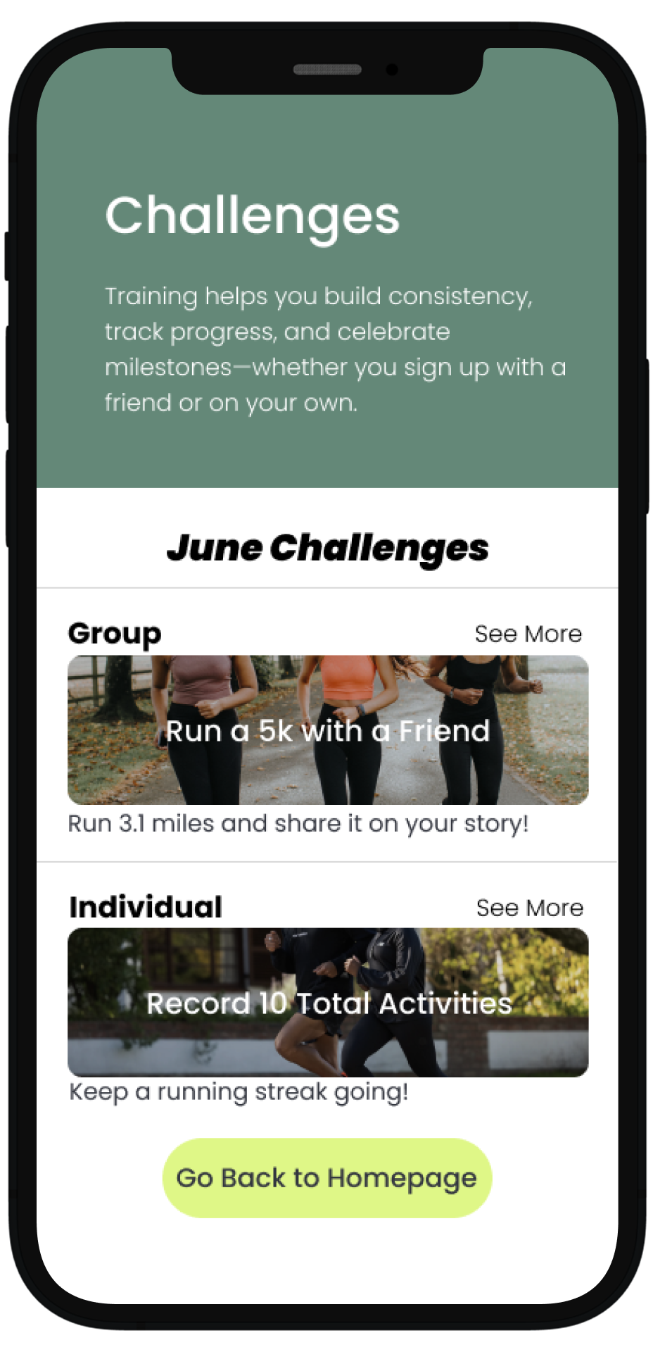
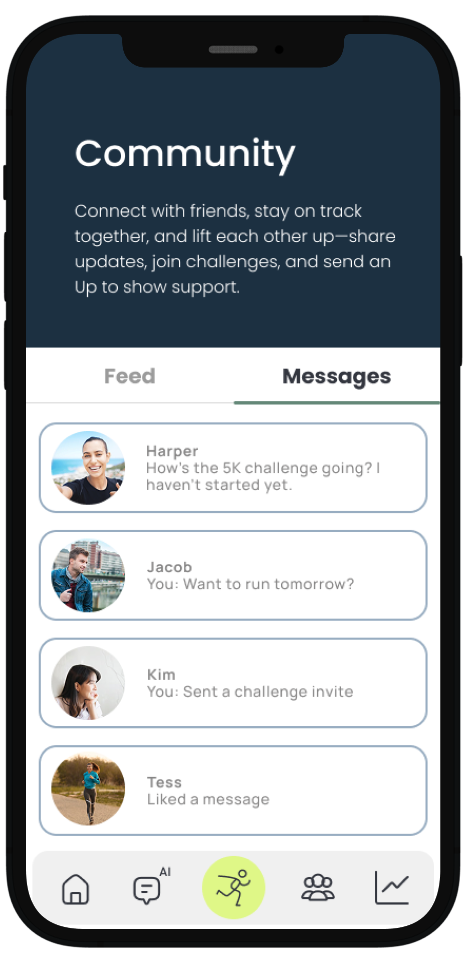
Community challenges provide users with clear goals and friendly competition, which boost motivation and accountability.
By offering rewards and recognition, these challenges encourage users to stay active and committed. This modified approach strengthens social bonds and keeps the app experience fresh and engaging.
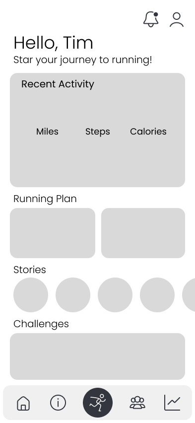
From Information Overload to Intentional Navigation
Refining Structure for Usability and Focus
During initial usability testing, a major pain point became clear: users felt overwhelmed by the sheer amount of content packed into a single scroll-heavy page.
“I kept scrolling but wasn’t sure what was important or how far I had left to go.”
“There’s just so much on one page and I didn’t know where to start.”
While the information itself was helpful, the presentation made it hard to digest, especially for beginners. Testers reported feeling lost, disengaged, and unsure of what to focus on.
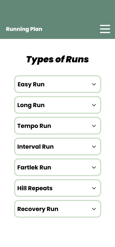
Introduced a Hamburger Menu for Simple Navigation
1
I implemented a hamburger menu to break up content into clear sections (Warm-Up & Recovery, Gear Guide, Mindset & Motivation, etc.).
This gave users control and made jumping between topics fast and intuitive.
Structured Content Into Digestible, Themed Categories
2
Instead of general information all at once, each category was carefully crafted to guide users through one key part of their running journey.
This taught users the why behind each element, such as gear, mindset, or physical prep.
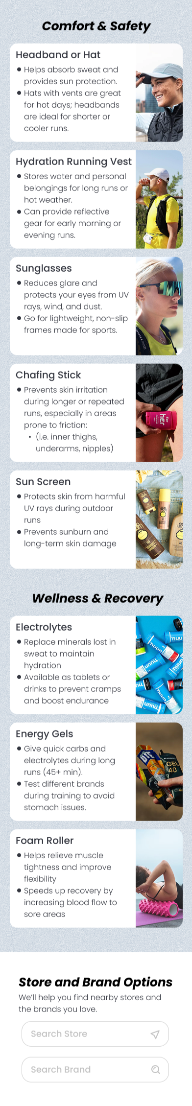
Designed Each Page With Focus and Clarity
3
I used consistent headers, short descriptions, and visual support such as photos, icons, videos to make the content feel easy to absorb.
Users could now scan, understand, and apply tips without getting lost or overwhelmed.

THE FINAL SCREENS
Style Guide
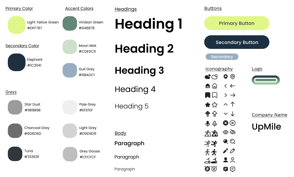
I chose a green color palette for the app because it naturally evokes feelings of growth, energy, and balance which are qualities that align well with running and fitness.
Green is often associated with nature and the outdoors, which complements the app’s focus on both indoor and outdoor running options. From a psychological perspective, green promotes calmness and motivation without overwhelming the user, helping maintain focus during training.
Before

Low-Fidelity
After

High-Fidelity
High-Fidelity Screens
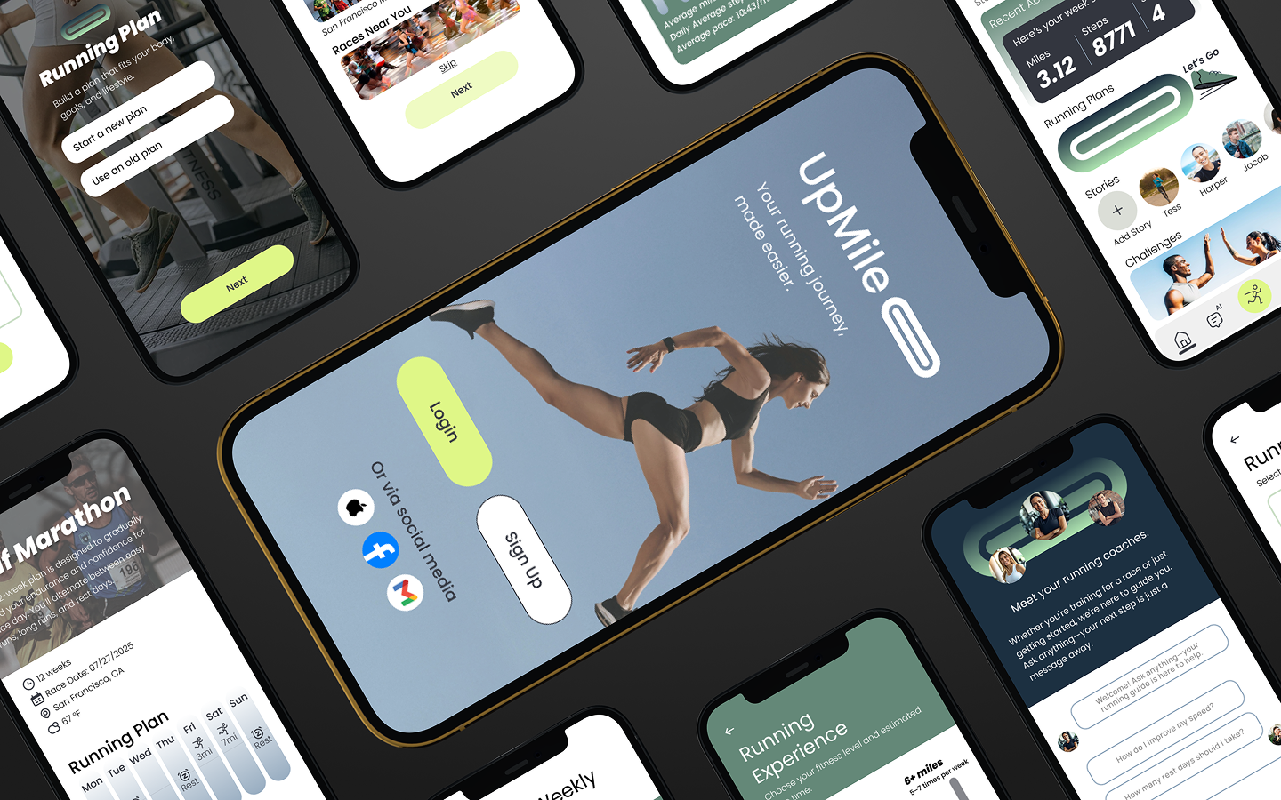
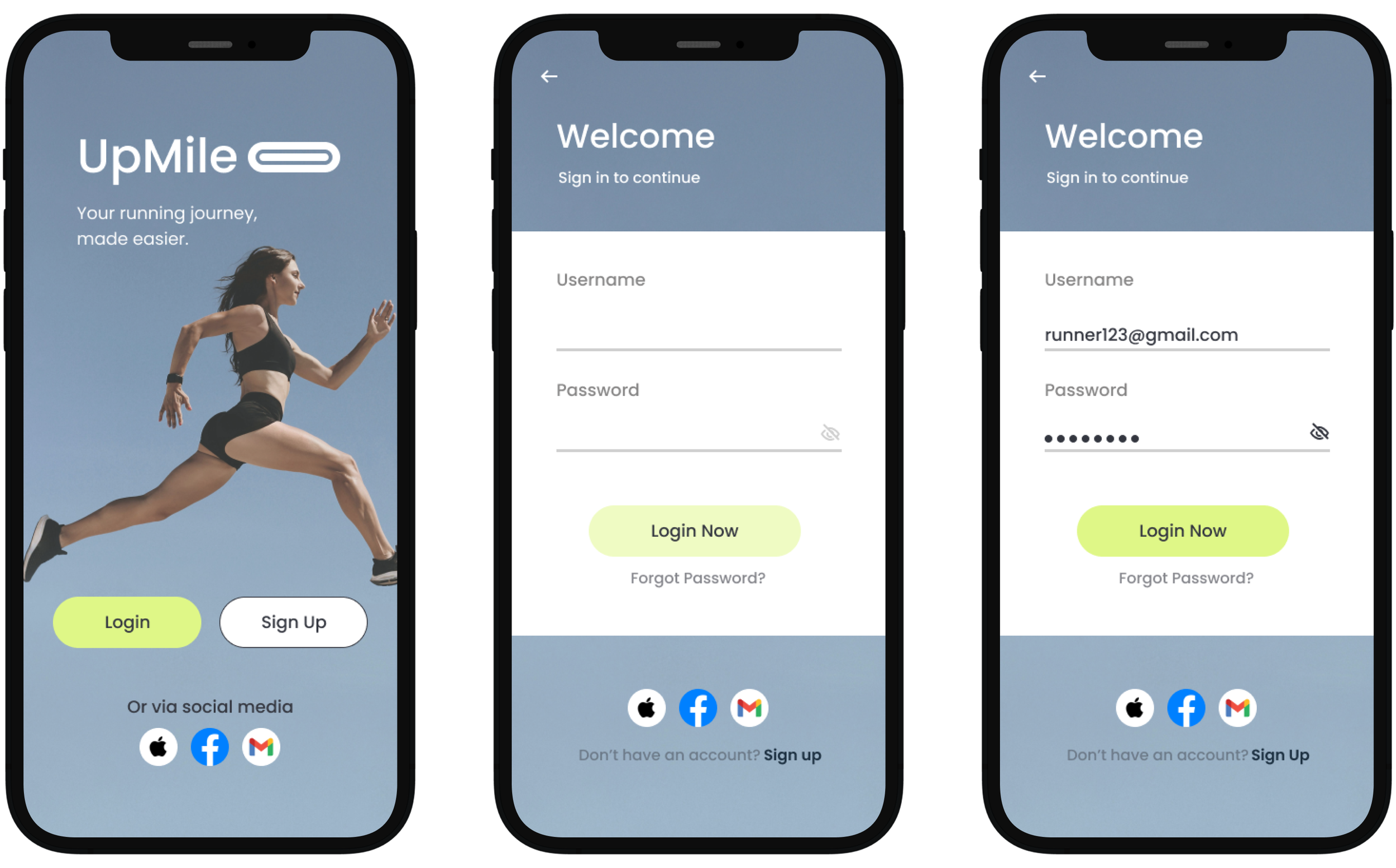
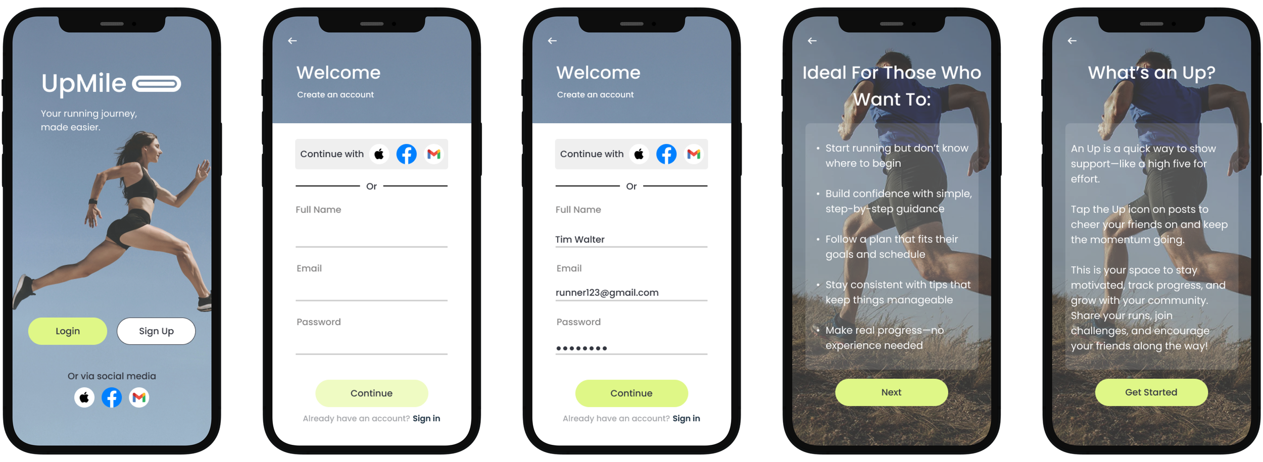
Sign In and Sign Up
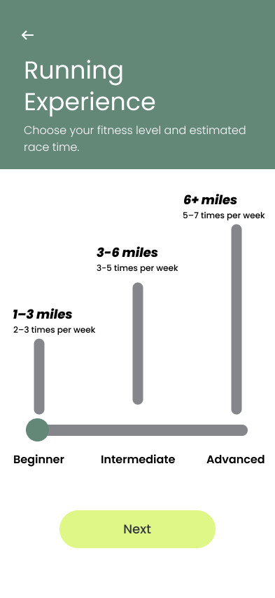
Red Route One - Create Running Plan
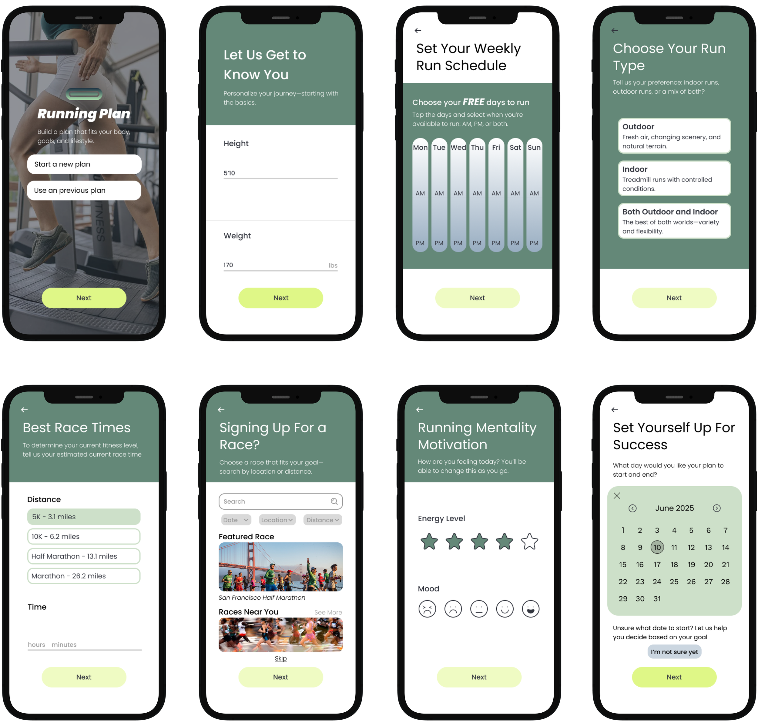
This flow allows users to build a personalized running plan tailored to their fitness level, schedule, and goals. Each step is clearly structured, with supportive language and clean visuals to help users make informed decisions. The design emphasizes clarity and customization, so users feel confident that their plan is achievable and suited to their lifestyle.
Your Running Plan
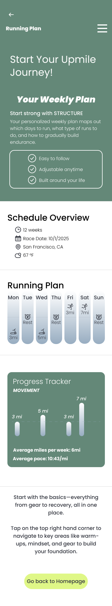


These result pages offer a clean, personalized experience aligned with each user's goals, schedule, and fitness level. Core details like weekly mileage, progress tracking, and run types are clearly displayed to keep users focused and motivated. The layout is intentionally simple in order to not overwhelm the users, but instead, help users feel supported as they build momentum in their journey.
Red Route Two - Use Previous Running Plan
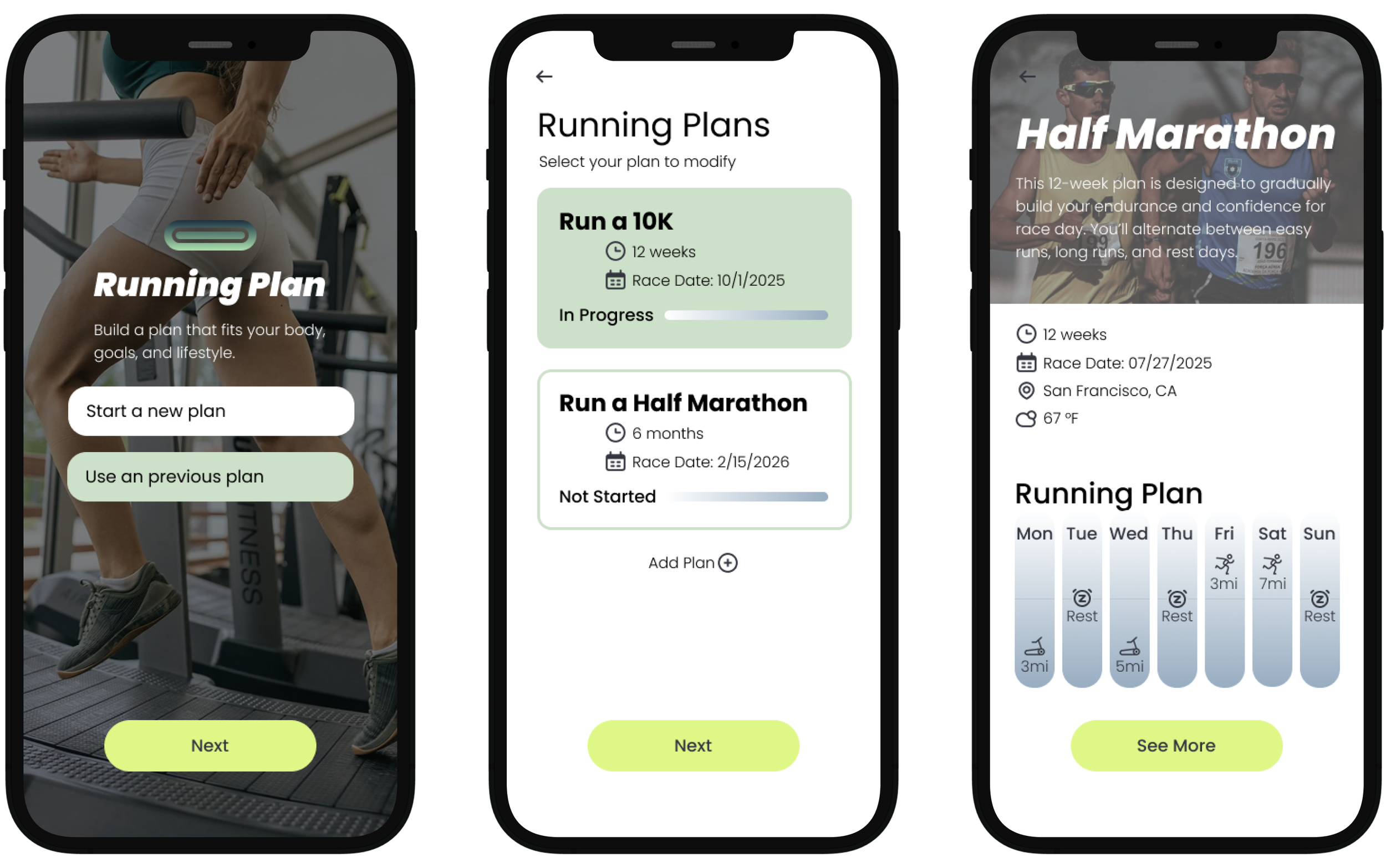
Editing supports real-life flexibility: users can adjust specific runs, change weekly targets, or update their timeline. The interface is modular and intuitive, making edits feel manageable without starting over. By allowing easy changes, this route encourages consistency and long-term engagement, even when routines shift.
Red Route Three - AI Chat
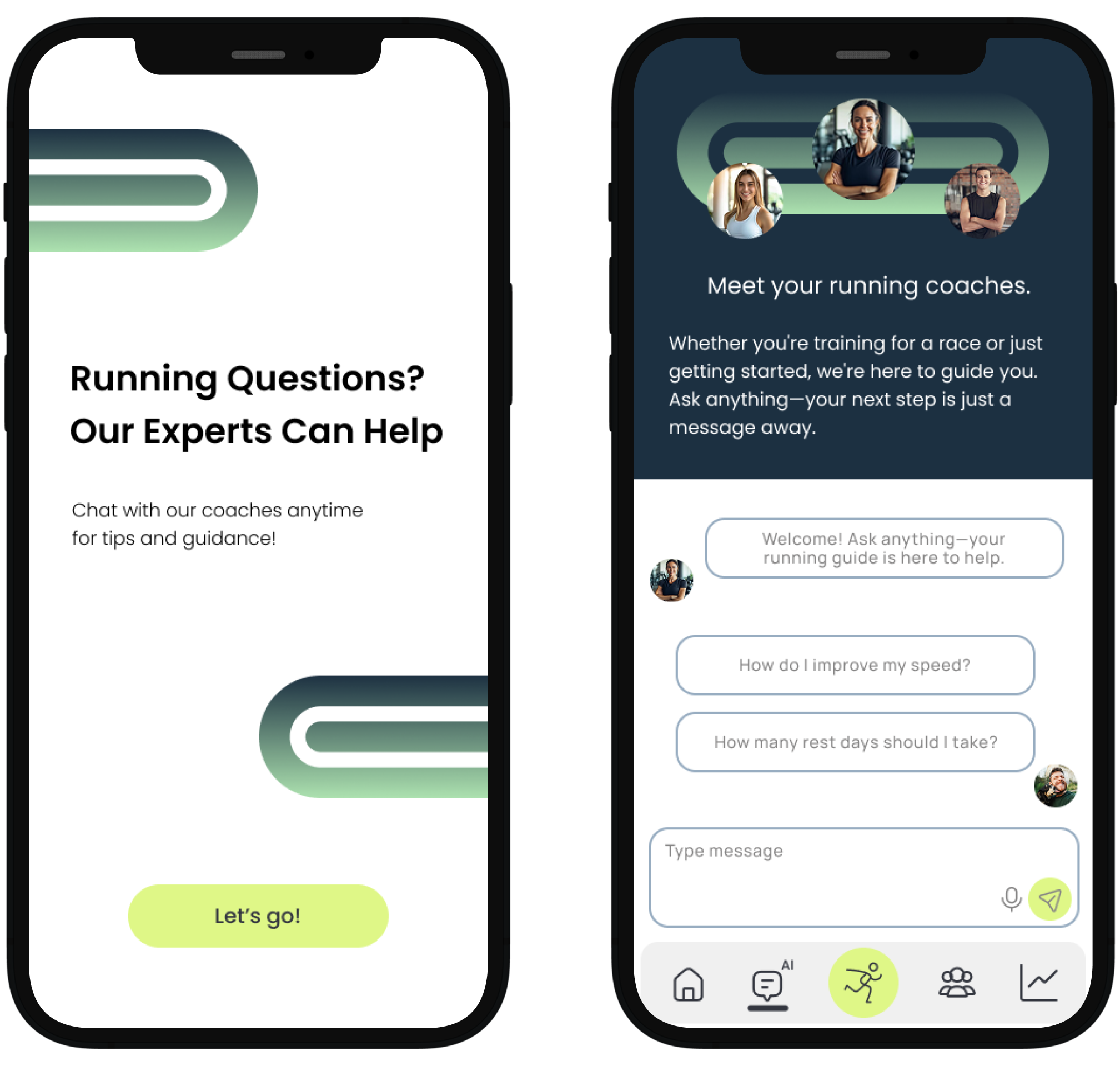
The AI chat feature acts as an on-demand running coach, offering guidance, answering questions, and suggesting adjustments based on user activity. It was designed to feel approachable and responsive, giving users a sense of real-time support. This not only boosts confidence but also strengthens the app’s role as a reliable and interactive tool in their fitness journey.
CONCLUSION
Key Insights & Improvements
Through multiple rounds of testing, I found that beginner runners aren’t just lacking motivation, they’re lacking clarity, structure, and reassurance.
Clarity in Plan Setup
While the redesigned builder guided users better, many still questioned whether their inputs were truly shaping their plan. This led me to introduce real-time feedback and visual confirmations, reinforcing that the app was adapting with them, not just spitting out a static plan.
Confidence in Gear & Prep
Users appreciated built-in gear advice, but often felt unsure how to apply it. I restructured the prep section into clear, visual modules, tied to each training phase. This gave users a greater sense of readiness and boosted confidence before their first runs.
Motivation Through Encouragement
Testers wanted to feel seen and supported, not just tracked. Small changes like celebratory messages, checkmarks for warmups, and optional mood check-ins helped the app feel like a partner in progress, not just a tool.
Humanizing the AI Assistant
While users liked the idea of an AI chat assistant, they disliked robotic responses. I redesigned it with empathy-driven prompts and contextual suggestions based on training progress, making it feel more like a coach than a chatbot, especially for those new to fitness apps.
What I Would Do Differently
The project began with a big question: How do you help someone who’s never run before feel ready to try? My early sketches focused on schedules, but they lacked emotional context. What I learned is that for new runners, mental readiness is just as important as physical.
If I could go back, I would start with a deeper focus on the emotional timeline of beginning a new habit. What are users feeling when they open the app for the first time? Are they overwhelmed, excited, anxious? By mapping those emotions first, I could align messaging, layout, and pacing even more precisely with their journey.
I’d invest more time into progress reflection tools, not just showing how far someone ran, but how their mindset evolved over time. A simple reflection log, motivational streak tracker, or peer-to-peer encouragement feature could extend engagement and reduce drop-off after the first few weeks.
Finally, I would explore more community-building tools that feel welcoming rather than competitive. While existing apps use leaderboards and public stats, beginner users often find this discouraging. My next iteration would experiment with small group goals, anonymous encouragement options, or AI-matched accountability partners to create meaningful motivation without performance pressure.