


Nomie - Travel-Style Itinerary Planner
My Role
As the sole UI/UX Designer for Nomie, I guided the product from early research through high-fidelity design, focusing on creating a calm, intuitive space for users managing multiple aspects of their daily well-being. I led user interviews, translated findings into clear design requirements, defined the information architecture, built the visual system, prototyped core interactions, and ran usability tests to ensure that each feature, from habit tracking to reflective journaling.
Duration
24 weeks
Overview
Nomie was created to help users better understand how their mood, habits, and daily routines connect. Many people want to build healthier behaviors, but existing tools can feel cluttered, rigid, or too data-heavy. My goal was to design an experience that made self-tracking feel effortless and personalized.
Tools
Figma, Miro, Google Docs
Scope
UI/UX, Secondary Research, User Flow, Competitive Analysis, Affinity Mapping, User Interviews, User Personas, Wireframing, Guerrilla Testing, Style Guide, Low-Fidelity, High-Fidelity, Prototyping

PROBLEM
Travelers Struggle To Plan Personalized, Budget-friendly Trips
As a travel enthusiast, I often found myself planning last-minute group trips with friends. While we always managed to pull the itinerary together, often adding activities on the go, the process was hectic and unorganized.
However, I’ve also noticed that although we sacrifice time and energy to plan, we often end up with disorganized itineraries, overlooked details, and choices that don’t always align with everyone’s preferences or budget.
Personalization is Key

Personalization Through Technology
Real-time data and mobile apps have made travel planning more efficient, giving users the ability to adjust plans and access updates on the go.
Online booking platforms allow travelers to compare prices, reviews, and options in one place, helping them make faster, more informed decisions.
Personalization features let users tailor their trips based on individual preferences and interests, creating more meaningful travel experiences.
*According to Travel & Tourism - Worldwide by Statista
Travel Style
Recognizing one’s travel style and setting realistic spending goals are key to effective trip planning.
Categorizing expenses ensures a more organized, budget-conscious experience aligned with individual preferences.
Travelers should strive to balance enjoyment with financial responsibility by aligning their budget with personal values and travel goals.
*According to Travel Like a Pro: Financial Planning for Every Type of Trip by Anis Suraya MohamedRESEARCH
Unpacking The Planning Struggle
Competitor Analysis

Key Missing Features Across All Competitors:
No Travel Style-Based Suggestions
None of the apps offered trip planning tailored to different traveler styles like spontaneous planners, experience-seekers, or meticulous organizers.
→ Insight: Travelers have different planning habits, but competitors treat all users the same.
Lack of Personalization
Beyond saving reservations, the apps lacked true personalization of recommendations, day-by-day structures, or experiences.
→ Insight: Users want trips to reflect their unique preferences, not just a checklist of activities.
No Integrated Budgeting Tools
Despite the fact that 80% of travelers use budgeting apps, none of the three competitors included built-in financial management like real-time price tracking or spending estimates.
→ Insight: Financial control is a critical part of trip planning but is overlooked.
Limited Flexibility for Itinerary Changes
Tripsy allowed some editing, but flexibility was not a major feature across the board.
→ Insight: Travelers often need to adjust plans on the go so apps should support dynamic updates.
How This Shaped My Design Strategy
These gaps created a clear opportunity Instead of building just another organizational tool, I focused my app on adaptive, user-centered travel planning. Specifically, I prioritized:
Travel Style Selection → Helping users plan based on how they prefer to experience trips.
Personalized, Editable Itineraries → Allowing drag-and-drop flexibility for all users.
Built-In Budgeting Features → Offering real-time price tracking and spending estimates from the start.
Quick, Intelligent Recommendations → Simplifying trip planning for users who feel overwhelmed by too many options.
By directly addressing what competitors missed, my app moves beyond logistics and helps users plan trips that feel personal, financially smart, and flexible. This brings real-world behaviors and needs into the core experience.
Affinity Map
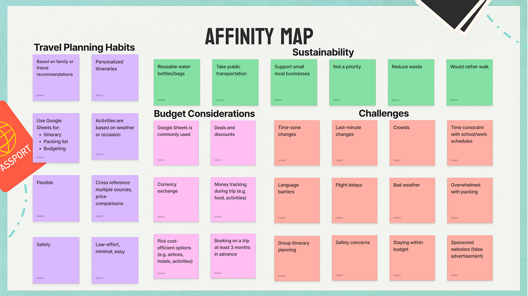
Using affinity mapping, I was able to group user feedback into key themes like budgeting, personalization, and flexibility, helping me clearly see what matters most to travelers.
This method also revealed common pain points such as decision fatigue and unexpected costs and highlighted differences in travel styles, which will guide how I design tailored features for a range of users.
INSIGHTS
User Interviews
As a travel enthusiast, I often found myself planning last-minute group trips with friends. While we always managed to pull the itinerary together by adding activities on the go, the process was hectic and unorganized.
However, I’ve also noticed that although we sacrifice time and energy to plan, we often end up with disorganized itineraries, overlooked details, and choices that don’t always align with everyone’s preferences or budget.
User Quotes
“I want to discover new things when I travel.”
“I don’t trust sponsored content.”
“I set a budget first.”
“I will plan the trip for the entire group because I need everything planned out from the start of the day till the end of the night.”
“I like information that’s quick and easy to digest. If an app or website is too cluttered or has too many steps, I lose interest.”
“I plan trips ahead of time, never last minute so I’m organized and save some money.”

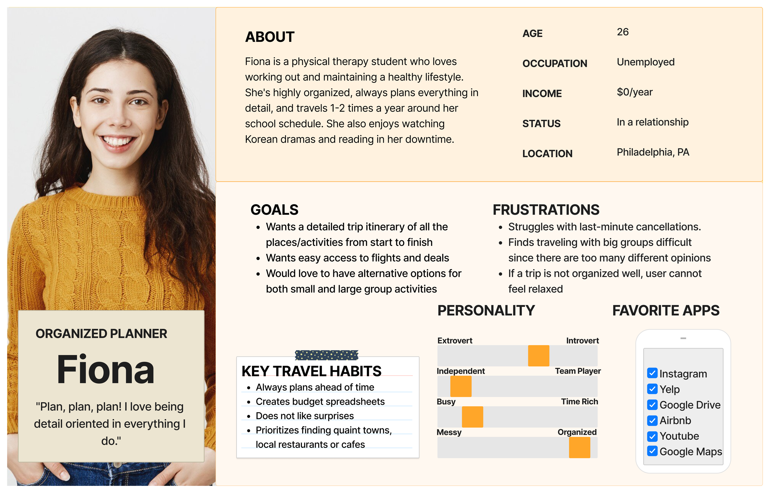
Main User Personas
In the early stages, I interviewed several types of travelers: spontaneous explorers, deal-hunters, experience seekers. I realized their struggles weren’t based on age or location, it was all about their travel style.
People like Ryan travel based on how they’re feeling and they don’t want strict plans.
Others like Fiona thrive on details. She wants structure, tracking tools, and clarity.
And there are users that are somewhere in the middle who plan loosely but still wants to feel in control.
These conversations helped me shift from a one-size-fits-all design to something that could adapt based on each user's travel style.
HOW MIGHT WE…
Simplify the travel planning process to reduce decision fatigue while offering personalized, budget-friendly options that adapt to different travel styles, from spontaneous explorers to meticulous planners?
DESIGN
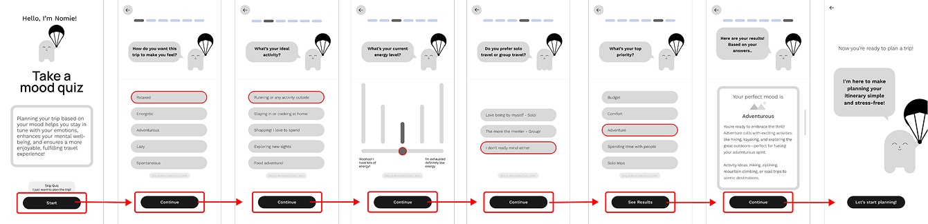
My first idea was a mood-based trip planner. The app would ask you how you're feeling and suggest a trip that matches that mood. It sounded playful and different, and users were intrigued at first.
But in testing, frequent comments included:
‘I don’t really know what “cozy” means in terms of activities.”
“I want to feel adventurous, but what if I just want a good meal?”
So the idea had charm, but it lacked clarity. Users couldn’t see how their mood would realistically guide a full trip plan. Ultimately, that disconnect led to my biggest pivot!
Early Ideations + A New Direction
User Flow
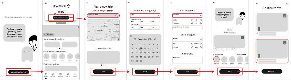
This user flow shows how the app guides travelers from the first tap to a fully personalized trip. It starts with a simple entry point, the App Cover Page, where users can log in or sign up. From there, they land on a Welcome Page and take a Travel Style Quiz that helps the app understand their preferences, like how they like to travel and what kind of budget they’re working with. After getting their results, they’re brought to the Quiz Triage Page, which acts as a jumping-off point to explore different parts of the app.
From this hub, users can head to the Home Page where they can view their itinerary, chat with the Nomie assistant for help, or update their profile. If they want to start planning a trip, they’re guided through creating a Personalized Itinerary. They can make changes, add details, and then view tailored suggestions for places to stay, eat, and explore based on their quiz results and budget.


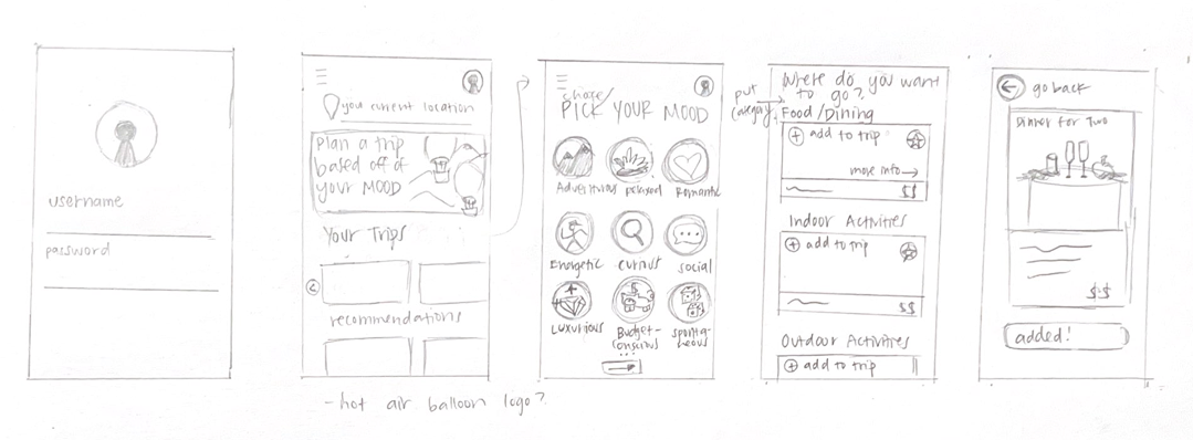
Wireframing and Guerrilla Testing
My sketches started by trying to narrow down the trip creation process. Early usability testing showed the layout was still too structured. I observed users hesitating, unsure of what step came next. So I redesigned the flow to be more fluid, removed extra steps, and simplified how people moved between browsing, selecting, and building their plan.
Red Route One - Create an Account
Red Route Two - Onboarding: Mood Quiz
Red Route Three - Plan a Trip
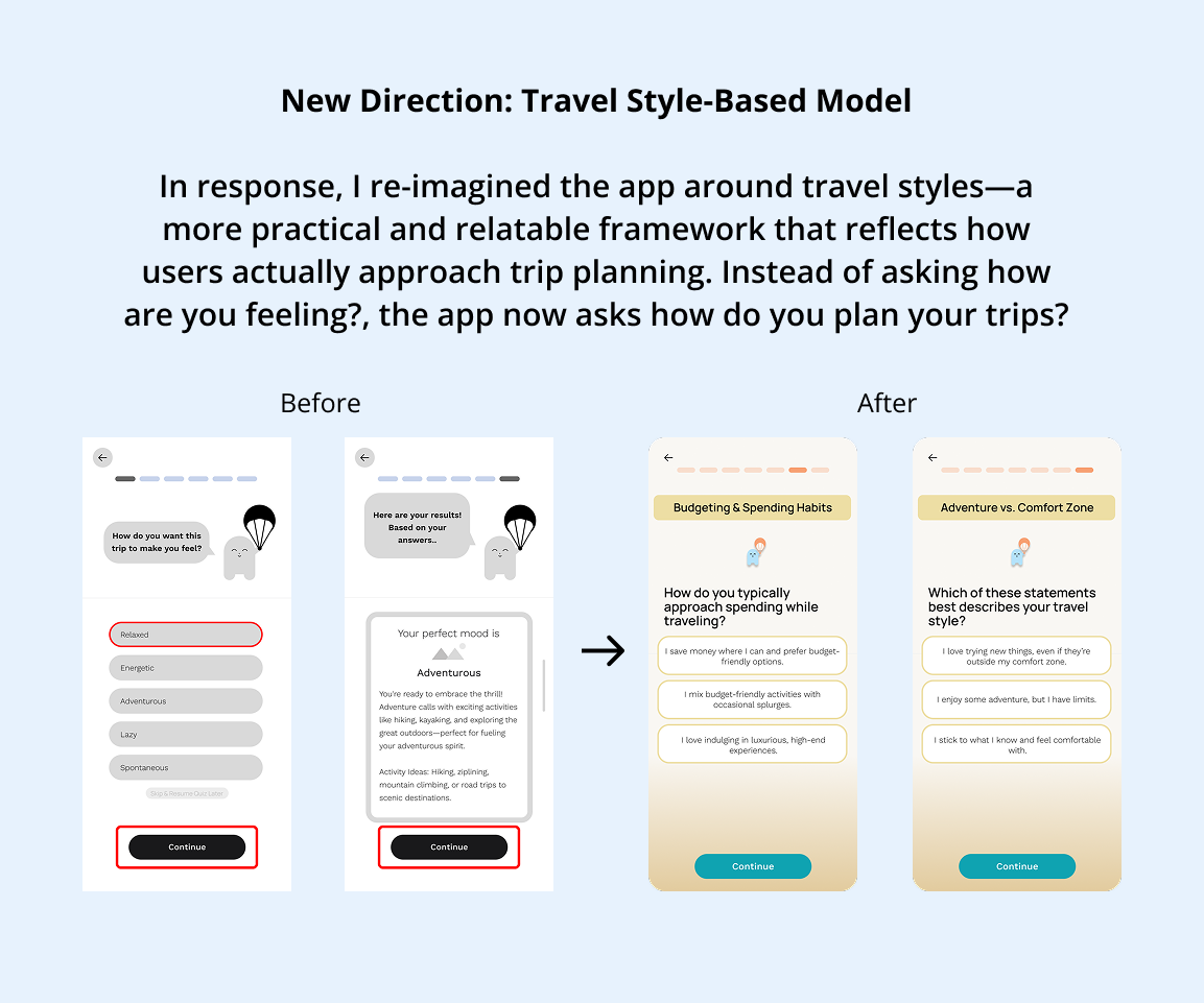
Shift from Mood-Based to Travel Style Planning
Original Concept
The initial idea for the app was centered around mood-based travel planning. Users would select a mood, such as adventurous, relaxed, or cultural, and receive a pre-generated itinerary tailored to that emotional state. The experience felt engaging and playful, and early sketches showcased a visually rich quiz flow leading to suggested activities, destinations, and themes. The aim was to reduce decision fatigue by offering emotionally driven recommendations with minimal user input.
Why It Changed
As secondary research deepened, a clear disconnect emerged between the emotional lens of mood and the practical needs of real travelers. 85% of users fell into budget-friendly or mid-range travel categories, with a clear focus on spending between $50–$200 per day. This revealed a key insight: users don’t typically plan trips around how they feel. Instead, they plan around how they spend.
USER PAIN POINTS
How I Addressed User Pain Points
Drag-and-Drop Customization
Recognizing the diverse planning habits of different travelers, I introduced flexible itinerary-building tools.
Users can now drag, drop, and swap activities to suit their pace and preferences, catering especially to planners without overwhelming users.
Integrated Customization and Budgeting Tools
Added filters for preferred activities, dietary needs, and destination types, allowing users to select specific travel goals and group preferences.
To support the 80% of travelers who actively manage travel expenses, the app now features real-time price tracking, estimated daily spending, and toggles to adjust for splurge vs. save options. This aligned directly with user behavior, making planning not just fun, but financially grounded.

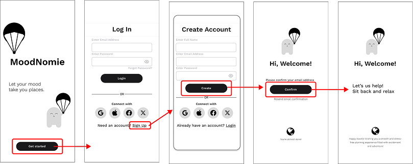
FINAL SCREENS
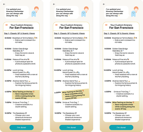
Final Screens
This is where the visual identity really came together. I used calming colors, lots of white space, and simple icons to reduce cognitive load. I introduced ‘Nomie,’ a friendly character that helps guide users.
Style Guide
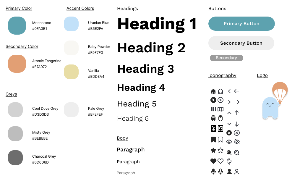
I kept screens minimal but clear, because almost every user I interviewed said that too many options made them freeze or abandon the planning altogether. I also made sure trip results felt tailored to the user. This included categories such as showing price ranges, transportation options, and clear sections for hotels, activities, and food to help make the experience feel personalized and useful.
Login

Travel Style Quiz

Homepage Navigation
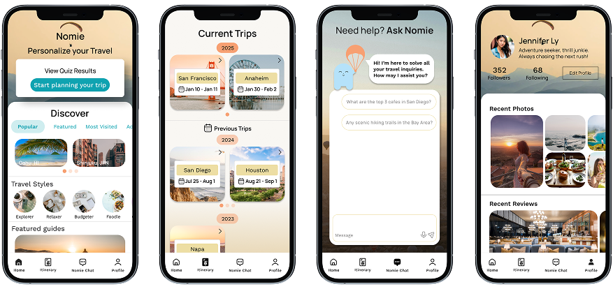
Plan Your Trip
CONCLUSION
Key Insights & Improvements
Throughout user testing, I discovered that users struggled with clarity after completing the Travel Style Quiz. The connection between quiz results and actual trip planning wasn’t obvious, which led to hesitation and drop-off. To solve this, I redesigned the Quiz Triage Page as a clear central hub, giving users direct pathways to plan a trip, view itineraries, or access planning help. This change resulted in a noticeable increase in task completion rates, especially for starting and editing trips.
Another key insight came from observing user behavior around decision-making. The original flow presented too many choices at once, which made the experience feel overwhelming. I addressed this by simplifying the layout and sequencing key actions, like showing personalized recommendations only after users had built an itinerary. This reduced cognitive load and helped users feel more in control.
Small usability tweaks also made a big impact: improving button labels, page transitions, and guidance cues helped users navigate more confidently with fewer questions. These seemingly minor changes led to smoother interactions and less friction throughout the app.
In the end, these improvements made the experience more intuitive, helping users go from curious to confident as they planned trips aligned with both their travel style and budget.
The project began with a broad concept: a mood-based travel planning app where users could plan trips based on how they felt, such as adventurous, relaxed, spontaneous, and so on. Early sketches and quizzes reflected this idea, allowing users to “feel their way” into travel suggestions.
Improve user flow for clarity – The initial idea lacked structure, so focusing on a more intuitive design will help users easily navigate through categories and find what matches their travel style.
Offer more personalized recommendations – User feedback highlighted that too many choices can be overwhelming. By providing tailored suggestions that consider both preferences and budget, the app will make it easier for users to find relevant options without the stress of sorting through endless possibilities.
Make the experience adaptable to various planning styles – Instead of sticking to a rigid mood-based approach, the app should allow users to adjust their plans based on real-time data, safety, and financial needs, giving them a sense of control. I’m proud of how my first project evolved, shifting from a broad, mood-based app to a more structured travel-style planner that meets users’ needs.